June 2, 2022
Artist to Watch
LITA ALBUQUERQUE
NB: What are some of your earliest memories of art?
LA: The very first one is a very odd one! We lived in a stone house in a fishing village in North Africa called Le Goulette. It was the house that my grandmother (who I never met) owned and had then passed on to my mother. In the kitchen closet was a sculpture that was literally thrown in there. I couldn’t believe that was a place where art went! We had a lot of literary things; we had a lot of music, but the visual arts came to me later on. That was my very first art piece. However, in the convent [where I studied] later, there were a lot of Renaissance paintings referencing biblical scenes. There was also a lot of Islamic art, pieces like mosaics. Tunisia has a lot of artifacts – not fine art per se, but beautiful blues and golds and reds. A lot of my work comes out of that. In terms of art I saw later on, I’m a romantic, so William Turner was my first love.
NB: How do you believe art informs spirituality, and vice versa?
LA: I think one of the things about art – really good art – is that there are no words for it. When you’re in front of a wonderful work of art, it’s an embodiment. How the work has gotten there is the product of the intricacies, life, and very lifeblood of the artist. It’s also their thoughts [as an artist] and the greater force of art history. It’s like good wine, it takes so long to be this work of art for which there are no words. There are no words because everything is already in there. How does that relate to spirituality? Some people don’t see this [all in a] work of art; to be able to see it, you have to be open. The very word ‘spirit’ means breath. For me, the spiritual is about being open, it’s about being in the moment. It relates to the cosmic address and having a perspective that takes one out of just being ‘here’ and puts one in the context of the reality of the whole. The spiritual is really the process of opening up to oneself, and to the cosmos. And that’s very different from religion.
NB: Is there a specific place, location or environment that has been particularly inspiring to you as a creator?
LA: I run on the beach and jump in the ocean everyday. I have to have that. Also – sunsets and sunrises, that kind of connection of beginnings. That concept of time, and the rotation of the earth around the sun, is totally inspiring. The desert – whether it’s dry lake beds or Antarctica which is also a desert as well – it’s such a minimal space that you instantly have to listen. There are certain spaces that bring our poetry in you, and you have no idea how or why. Tunisia is like that. People who come from Tunisia, if they’ve left, always talk about that. There was also the artist’s colony [in Malibu] where I grew up as an artist, that place had the same sense and feeling. It wasn’t anywhere else. It’s very interesting, in that way. It all comes down to nature.
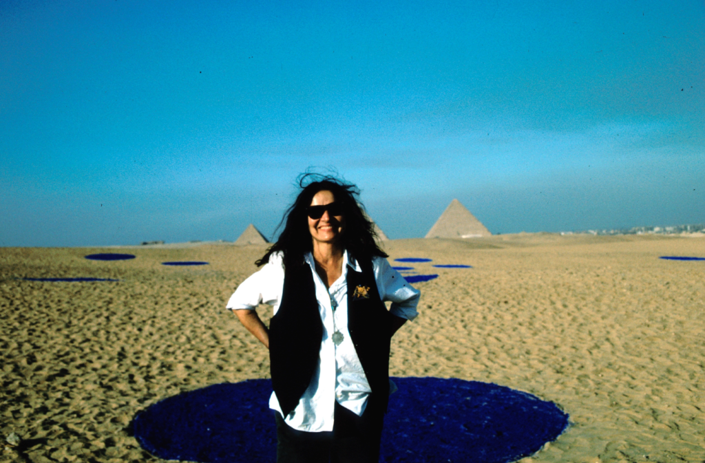
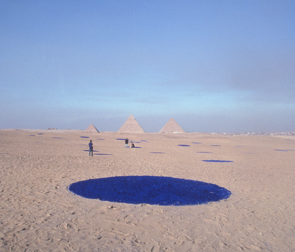
NB: You’ve created many incredible site-specific installations in very dramatic climates. Could you speak further to your projects at the Great Pyramids for the Cairo Biennale, and the work Stellar Axis in Antarctica?
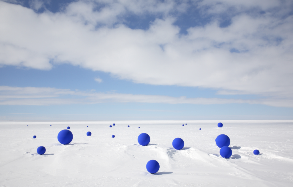
LA: For a long time I have been thinking about connecting the planet to the stellar system it is surrounded by. What I mean by that is that my interest is to show that planet Earth is not an isolated planetary body, that it is in a vast system of moving stars, within a moving galaxy etc. By placing circles of blue pigment on the desert floor in alignment to the stars above or sculptural blue spheres on the ice in Antarctica, is a way of presencing that moment in time which makes us think of our connection, that everything is interconnected. Both projects stem from the same idea of connection, but the first one in Cairo, was going off of the Stellar Correlation theory devised by Robert Beauval, that the pyramids at Giza had been placed in alignment to the Orion Constellation. I went off of that premise. In Antarctica, it was slightly different, by then I had had the vision of seeing Planet Earth from space, dotted with gold tipped pyramids, all aligned to the stars. This created an even greater urgency in me. To re-create that map (for it is almost certain that it had been made in ancient times), and that I would start at the north and south poles. Antarctica has many restrictions and I could not bring in any particles that might pollute the atmosphere (pigment) so I came up with creating blue spheres of different diameters to correspond to the different brightness of the stars above, and positioned them in alignment to the 99 brightest stars in the southern hemisphere. The difference in the two projects is that I also did a performance showing the motion of the stars at the poles in which they move in concentric spiraling circles around the pole, and not from East to West as in the northern Hemisphere. The Stellar Axis project spoke to a much larger vision because I created that performance at both the north and south poles; it was taking on the whole globe.
NB: Can you tell us about the projects that you have coming up?
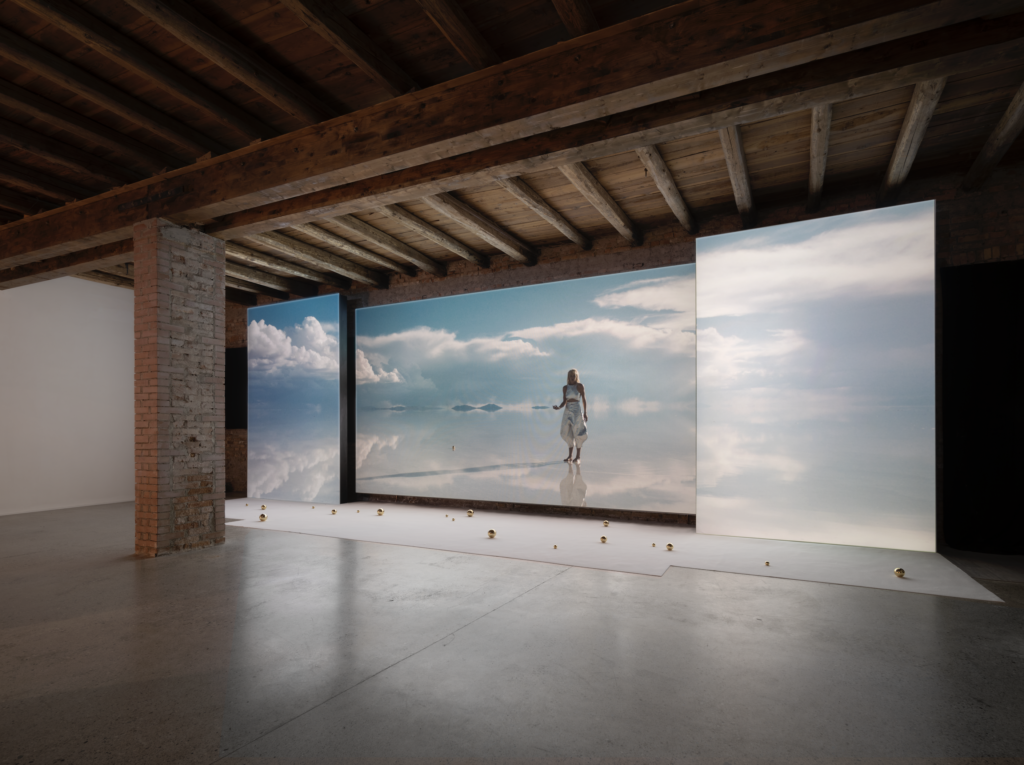
LA: The big project that I have coming up is at the Venice Biennale, Collateral. It’s a film installation with a film that I shot in Bolivia called Liquid Light, which is the second part of a trilogy featuring the character that I’ve been creating – a 25th century female astronaut who comes to the planet to teach us about all of these ideas of light and relationships to the stars. We’re presenting the film as a three-part projection and there will be salt and honey spheres in the installation, along with gold spheres. There’s also sound.
NB: Is there anything else coming up?
LA: I’m having a solo show at the Kohn Gallery coming up soon. I’m also working on some performances, films and a book.
April 7, 2022
Artist to Watch
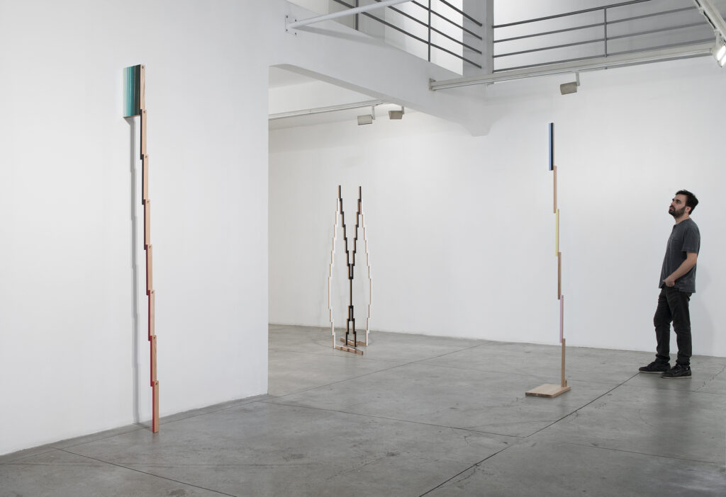
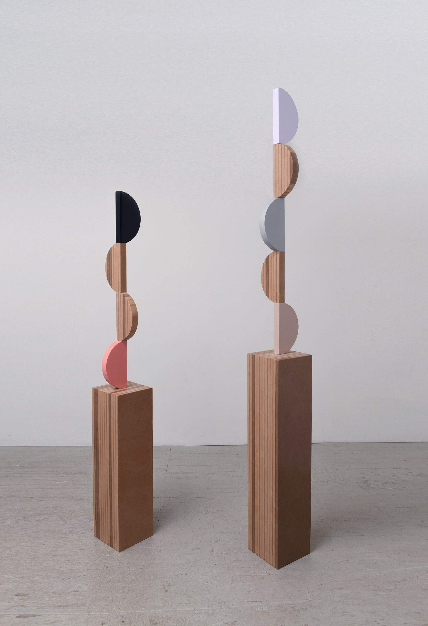
Reuven Israel
NB: What are your earliest memories of art?
RI: I grew up in a religious household, Jewish Orthodox, not Ultra-Orthodox, but modern Orthodox. My mother was on the religious side of the family, and my father was more secular. In this religious background, there wasn’t much visual stimulation. Art in our local Synagogue was limited to attributes to the twelve tribes of Israel and the lions of Judah ornaments on the coverings of the Torah scrolls. On the other hand, I used to accompany my father–who was a Journalist and writer–on his research trips for a guide he was writing on the monasteries in Israel. I would sit in chapels and churches, waiting for him to finish interviewing a monk in the back room. These spaces were in contrast to my Jewish upbringing, full of forbidden artifacts, statues, depictions of Mary, Jesus and saints. Everything was radiating a forbidden sense wrapped in the smell of incense and damp corners, hundreds of years old.
In regard to Western Art, I think the first painting that I was aware of was Hieronymus Bosch’s Garden of Earthly Delights. We had a reproduction of it hanging in our dining room, and as kids, we spent hours finding all these little sexual perversions – all these little anecdotes. When having friends from school over, I was embarrassed by this hanging in our house, but enjoyed seeing their shock.
Growing up, around the age of 17 I started teaching myself oil painting. I was inspired by looking at art books and some museum guides my father had brought back from Europe and America. It was before the internet became what it is now, so to look up paintings, I had to go to bookshops. I used to buy all these handbooks, these Taschen volumes about artists. I was obsessed! I would stare at them endlessly and read everything. Many of my thoughts emerged from art history and looking at these books and artworks reproductions. Then, one day, I realized there was a museum not too far from me, the Israel Museum in Jerusalem. It dawned on me that I could go and see some of these paintings in their original form. My memories from childhood of the museum were of the archaeological parts – like seeing the Dead Sea Scrolls. I hadn’t realized that they had a European painting collection – and they have quite an impressive one! It was amazing, and I went many, many times. Those were my first memories. Later on, in my early twenties, I traveled to Europe to see Caravaggio in Rome and Vermeer in Amsterdam.
NB: Could you speak to your source of inspiration for your practice? I’ve read that concepts such as religious monuments and science fiction have had an impact on your work.
RI: I can draw a thread from my practice now, back to when I started my interest in sculpture more than 15 years ago. There is this very gradual evolution in my work, both of the forms and the conceptual framework. Like scaffoldings, each new body of work is built upon the previous one. Religion has been an ongoing inspiration, rooted in the fetish quality of the works. I used to work a lot with MDF and manipulate it to look like different materials, such as plastic and metal. This fetish treatment of endlessly sanding and caressing the forms avoked this feeling of sanctity in the final objects. It took me back to my personal story, sitting in churches and staring at religious architecture and artifacts. I incorporated into my work particular geometries relating to specific places in Jerusalem. I was trying to decode the feeling of sanctity that certain objects and places have and use it as a means inside the pieces I create. Planting this religious “DNA,” provoking an aura of sanctity in pieces that look like they relate to mass production and furniture, that seems to almost have a functional purpose, but then again, you’re not quite sure what.
In addition to looking more and more into religion, science fiction started to evolve as another source of inspiration. My sculptures often felt like they had landed on the gallery floor from outer space, which led me to do watercolor studies of the shapes I was working on, drawn on large blackened sheets of paper. I draw sculptural elements as if hovering without gravity on the black surface of the paper, peculiar alien forms floating in space. Some of these studies became actual sculptures, and most didn’t. I then started looking further into sci-fi to make the pieces reflect this alien feeling even more. I went on a ‘sci-fi diet’ for a few years, where I mostly read sci-fi books and watched sci-fi movies and TV series – I was trying to break down that language. I wanted to see how this visual diet would come out in my work. Looking into sci-fi somehow took me back again to religion and archaeology. The original elements that drew me to sci-fi (or made my objects look a bit sci-fi) were such because I was looking at the same things for inspiration as people interested in sci-fi were. There is this paradox in sci-fi wherein trying to imagine the future and far away alien civilizations. Instead of looking forward, one looks back to history, to periods like the Middle Ages or ancient Egypt.
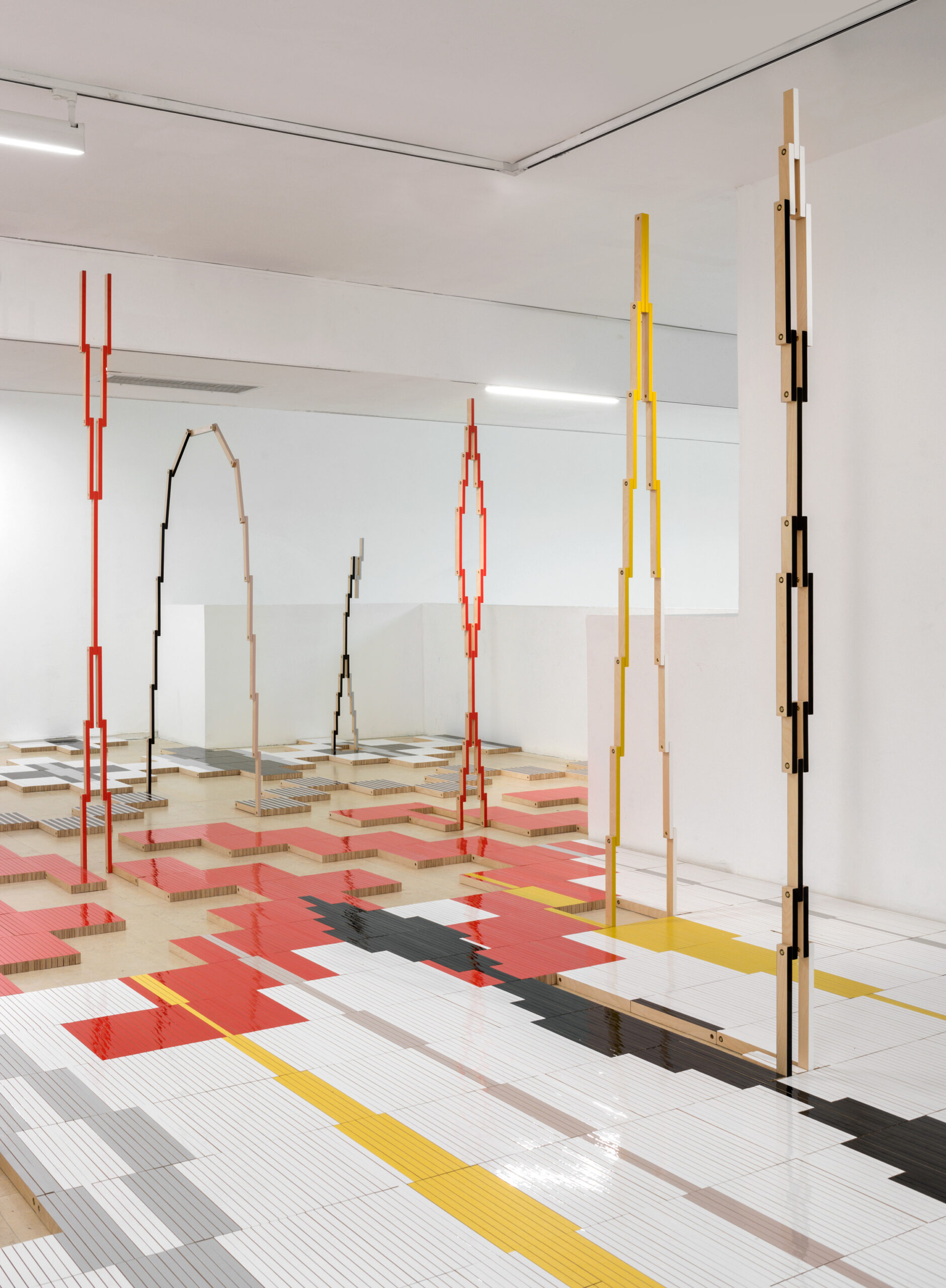
In the folding objects series that I’m working on now, a very specific geometry is created when the pieces open and close. This geometric language reminded me of weaving, specifically native American indigenous weavings. I started looking into Navajo rugs and then into designs on Hopi ceramics, trying to understand why this language that I’m working on suddenly has this association with these cultures. No doubt that this exploration influenced the shapes I created. From this exploration, I understood the connection between the mythological framework behind the indigenous patterns to my personal experiences, participating in shamanic ceremonies, relating to what I believe to be linked to this visual language.
NB: I know you use a wide range of materials in your pieces. How do you think about these different substances in the creation of your work? What do the interactions between the materials mean to you in your practice?
RI: When I started experimenting with sculpture, I wanted to imitate plastic. I didn’t want to work with plastic, and I didn’t want to cast plastic. I wanted to work with a material pretending it is plastic. This led me to MDF. By sanding it in a certain way, rounding the edges, and coating it with paint, it could take on the appearance of different materials. I like the basic idea in art that a thing is not what it represents, taking something and making it look like something else. I was interested in representation, but without representing a figurative depiction. I didn’t see a reason for sculptures to represent something else because they are already objects in the world. Why should one object represent another object?! Why couldn’t it just be itself ?! At the same time, I didn’t want my work to lose a relationship to concrete things in the world entirely. One of the core relationships I maintain is representing material almost as an image. Plastic and all of these sleek surfaces that surround us come with their luggage; they have a subtext. Plastic is taking over the world! This artificial material has a seed of destruction.
When you look at a lot of my pieces, the material itself is a piece of the puzzle, and it’s not what you think it is. There is a distance between what the sculpture is talking about and how it looks. It’s deceiving your senses and your thoughts. I still work with MDF but less and less. I also started using materials that spoke the same language. I found these metal rods used for grounding electricity. They are made of steel coated with a thin layer of copper, relating to my logic of painting things to hide them. I bought a bunch of these rods, and I started skewering sculptural elements on them. Individual wooden elements come together as a sculpture, a visual poem.
When I started the folding pieces, I initially continued with similar logic and painted their edges in color spectrums, reaching from green to red through small gradual color changes. A couple of years ago, I started work on a site-specific installation for the CCA in Tel Aviv that required 5,000 segments of wood. To paint 5,000 segments of wood is ridiculous! I also wanted people to walk on the piece without scratching or damaging it. I found an edge banding technique to apply a very thin layer of colored PVC on the wood. Nowadays, I use this technic to create large-scale immersive installations.
NB: Do you have any upcoming exhibitions or projects that you’d like to share?
RI: I just had two solo shows recently. One was at Shulamit Nazarian Gallery in Los Angeles, and the other was at the Center of Contemporary Art in Tel Aviv, which I just mentioned.
When I was invited to propose a piece for the Center of Contemporary Art, I had just finished working on folding sculptures that could unfold into different shapes and forms and shift in scale from flat rectangular shapes into large geometric patterns in the space. I decided to tile an entire gallery with thousands of wood segments connected to each other. From the interconnected tiled floor, I pulled groups of segments that opened up into three-dimensional structures, leaving empty swathes of the bare floor beneath them: an intricate game between two and three-dimensional patterns, resembling a digital space coming to life. To enter, one had to walk on the art. This took me back to religious ideas – like, taking off your shoes before entering a mosque or temple.
At the same time, I had another show in Los Angeles, with wall pieces that could also shift. Sleek geometric surfaces moved on tracks, opening from closed shapes into larger geometric landscapes. There were other folding pieces too, hung like rugs on the wall, unfolding down and spilling to the floor, with parts of them rising back up into sculpture in space. I liked the idea of having a floor show on one continent and a wall show on another.
I have two upcoming projects in Istanbul. A solo show in May at Sevil Dolmaci Gallery. The other will be in September, at a non-profit space. It’s a project I’ve been working on for a while, with Panos Tsagaris-A New York-based Greek artist, and Christian Oxenius, an Istanbul-based, German-Italian curator. The project is growing, and a Turkish curator and another Turkish artist are joining. It will be a satellite event during the Istanbul Biennale.
March 9, 2022
Artist to Watch
DAZE
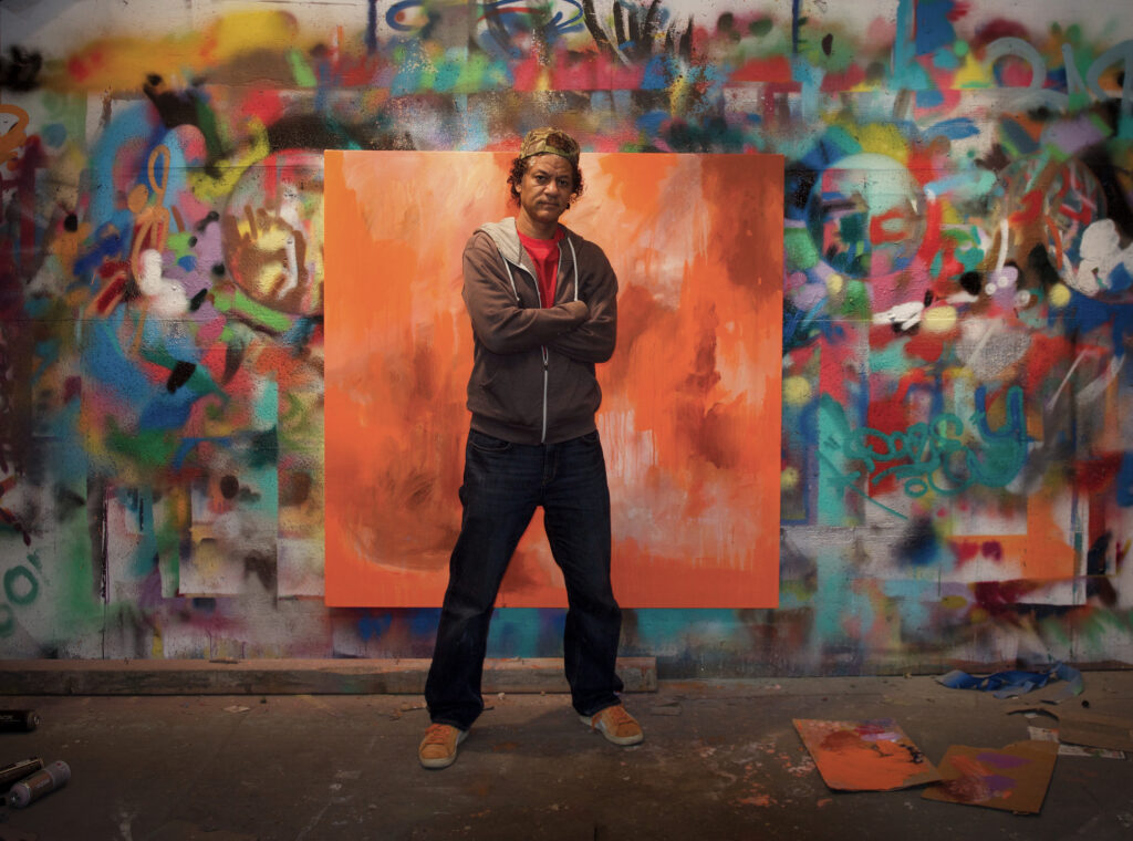
NB: Can you share the origin of your name, Daze?
Daze: The origin story is funny and typical. It’s very important to choose a name that will define you as you continue on; a name that no one else has at the same time. The originality is a big factor. I went through a lot of different possibilities. I started thinking more along the lines of which letters I could draw best, and which letters had a certain flow. That’s pretty much how I came up with it. It’s not just choosing a name, but that name and the letters in that name have to have a certain compatibility. That’s how it came about.
NB: Around what year was that?
Daze: This was in 1976.
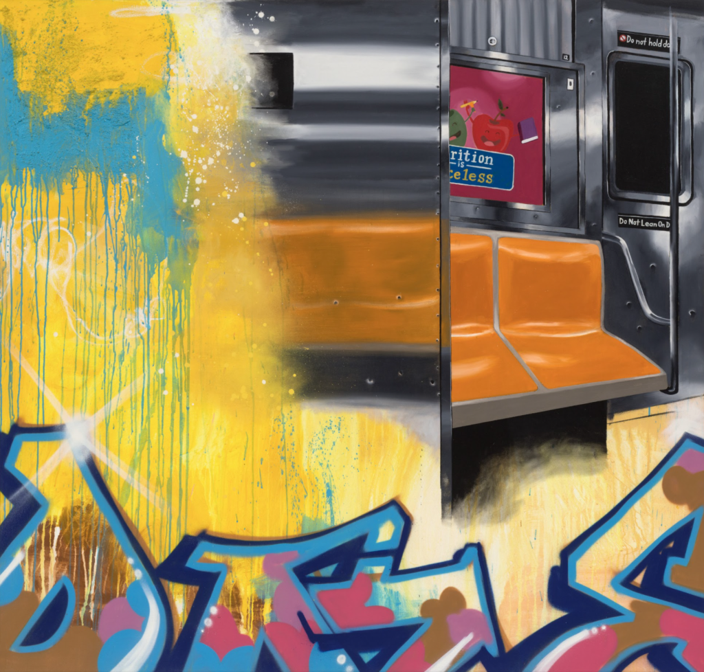
NB: When I saw your recent show Give It All You Got at PPOW, it felt like such a love letter to New York and the streets. It was beautiful. Which part of New York City are you from, and which part of the city – either physical or philosophical – inspires you most?
Daze: I’m originally from Crown Heights, Brooklyn, although I have maintained a studio practice in the South Bronx for more than 30 years. I’m definitely immersed in the culture and what’s going on in the Bronx. In terms of my favorite part of the city, I have a love/hate relationship – like a lot of people – with New York. I draw inspiration from all five boroughs. I try to focus on things that are really distinct about each borough. For example, I did a series of paintings and photographs of Times Square. It was from a touristic point of view and not from the point of view of the old school Times Square – the one that I knew while coming up in the city; it’s a bit more contemporary. In the Bronx, I’ve done paintings of everyday life and everyday street scenes that I encounter in my commute to and from the studio. In Brooklyn, I’ve done a huge series about Coney Island, which is very distinct. Also, I did a whole series of paintings about Staten Island, and it’s ferry, because that’s something that I enjoyed doing as a child – taking the ferry ride on a hot summer day. As a child going to Staten Island seemed somehow exotic. Watching the ferry pull away from the terminal in lower Manhattan I felt that anything was possible here. I draw from all of those experiences, and try to focus on things that can only be found in New York.
NB: Tell us about the transition process from creating your work as graffiti interventions in the city environment, to presenting your pieces in the fine art gallery space — from the streets to the studio? How did you navigate that, and how did it feel as a creator to make that change?
Daze: For me, the transition from doing my work in the subways or streets to the studio was very natural. I was always drawing and creating on paper as a kid, whether it was just illustrations or comics. The return to that practice was, for me, a very natural part of my evolution as an artist. There are two different mindsets when you’re painting in the street, and when you’re painting in the studio. When you’re in the street, you’re working in this very physical environment, and you’re interacting with everyday people. There is also a sense of immediacy, the sense of ‘I’m not going to paint something and come back to it tomorrow.’ I generally like to create my mural works in a couple of days at the most, if not one day. In the studio, you have the luxury of being able to spend more time on a specific work. However, it’s much more of a considered process. I’m thinking about what I’m doing and I’m creating work gradually. Some works could take a couple of days, and some works could take six months, depending on the painting. That’s really the luxury that having a studio provides you. You’re able to stand back and live with your own work for a while.
NB: The wonderful exhibition of your work, Give It All You Got, recently closed at PPOW. Can you share with us the background of the show?
Daze: A large part of the work was created during the quarantine that New York endured in the early stages of the pandemic. A lot of the work examines my reaction to it. However, I see the show as a bridge between many different things. It’s a bridge between old New York and contemporary New York; it’s a bridge between my two sons and myself, because they appear in several of the works; it’s a bridge between a culture that is very much underground and the more mainstream populous, and presenting [the underground culture] to the [mainstream populous]. It’s about creating these bridges that people can cross to see what’s happening. A lot of work went into it, hence the title. When I came up with the title (it came from a song) I thought ‘wow, this really sums up how I feel right now.’ I didn’t want to hold back, I wanted to put everything into the show. Especially at a time like now, in New York and in the way that people are feeling. People are longing for some sort of return to the way things were (before two years ago), but also perhaps for something new – at the same time.
NB: Are there any upcoming projects or exhibitions you can share?
Daze: I am going to continue to work in the studio. I also do a lot of work with students that had been on hold for the last two years, because of not being able to work together in person. I am going to make a return to those mural projects with students, as I think we’re in a climate now where that can happen. In terms of exhibitions, I have a lot of exhibitions coming up in Asia. The first one is at the K11 Art Space in Hong Kong, called City as Studio, it’s a large exhibition that will be curated by Jeffrey Deitch. After that, Beyond The Streets, curated by Roger Gasman, is traveling to Shanghai. Finally, there is an exhibition called Somewhere Downtown which will take place in Beijing at the UCCA, curated by Carl McCormick.
NB: One last thing – my own personal question – do you have any good stories from the Mudd Club?
Daze: The Mudd Club was really interesting; I was so young. Here’s a story: the fourth floor of that space was run by Keith Haring. The owner of the Mudd Club had sort of just said ‘I have this space, you can do what you want.’ He would let Futura or Fab Five Freddy come and curate. There was a real seminal exhibition called Beyond Words. A lot of now-famous people were in it, who weren’t really famous at the time. I remember Keith had this piece of wood that he wanted to put in the show, and on the wood he had these crawling babies sort of following dogs. Keith said, ‘this is my stuff; this is what I do’ and I remember saying to him ‘oh, cool!’ – but thinking to myself, ‘wow, he doesn’t really have a future, if this is what he does.’ But very quickly, I was proven wrong, because of course he created a whole vocabulary from those two simple figures.
NB: We read in the history books about the Mudd Club – not that many people are still around who got to go there!
January 25, 2022
Artist to Watch
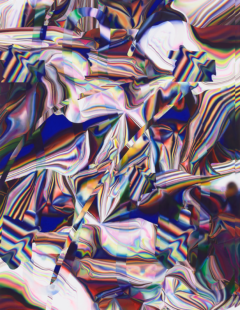
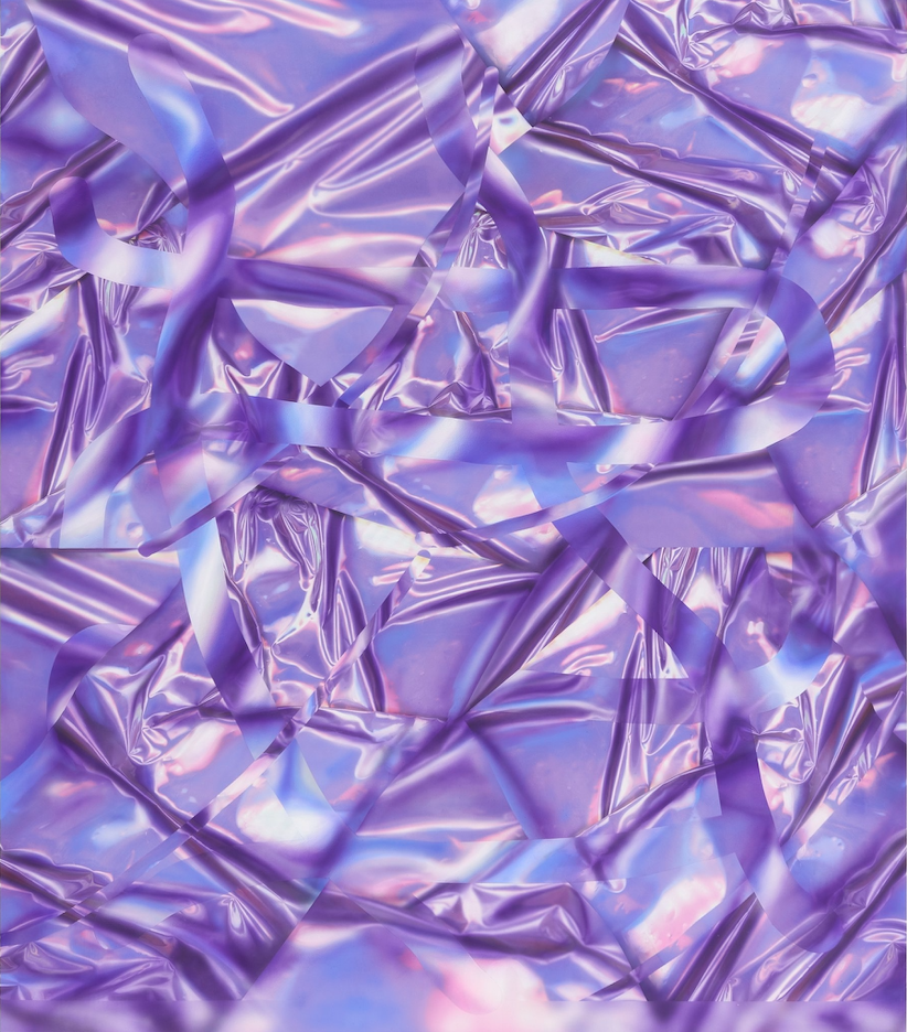
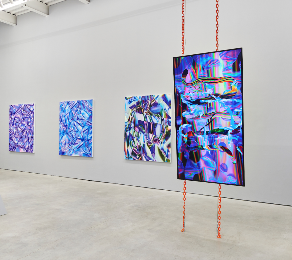
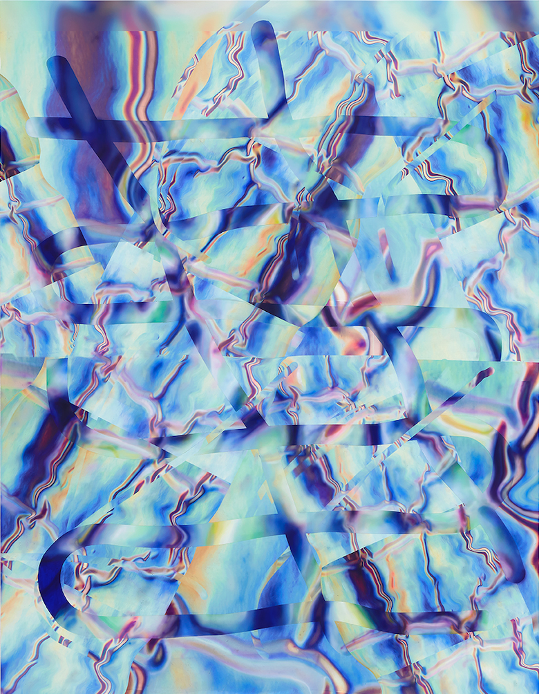
ANNE VIEUX
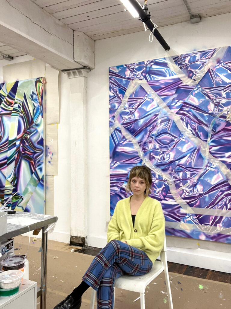
NB: What was the genesis of your practice incorporating both digital and analog concepts? Could you speak to how you view the boundaries and tensions between these two areas?
AV: The boundaries between these spaces are constantly being negotiated and redefined. Every material including pixels and paint have physical and visual limitations. I enjoy combining them in my work and find a sense of play in that process.
The distortion of data and capturing light have been important to me since I started working as an artist. My parents started a weather modeling company out of our home when I was a kid, so I grew up around meteorology images and computers. I have always found the effect of mediation by technology on reality fascinating.
When I moved to New York the limited amount of space I had to work in provoked me to start experimenting with my scanner more and digitally manipulating the images I created. I always thought of these distorted images as painterly, so it felt natural as they started coming into my paintings. Working back and forth from software to physical paint, there is a dissonance in that process (as well as experience in daily life) that comes into some kind of order when I work through my pieces.
NB: How do you look to past ideas and concepts from art history in creating your pieces? Are there other artists you look to in your practice?
AV: I feel connected to so many artists and periods of history for different reasons. The history of painting is rich with subjects around the sublime and importance of light. I think of part of my practice as in search for a technological sublime. There is also a history of artists experimenting with technologies and using unlikely tools to discover their own kind of idiosyncratic language.
I look at Color Field painting and think of the gestural application and surface concerns when thinking about abstraction. I think of light, color and pixels as fluid mediums. I use color and form that can be associated with cosmetic or narcotic, that are contained by strong abstract compositions and gestures. The idea of combining “high and low” cultural influences that seem to me as very American art history influence.
I look to the: experiential approach to painting of Katharina Grosse or Helen Frankenthaler. The material exploration and abstraction of Judy Chicago or Larry Bell, and Albert Oehlen and Sigmar Polke, to the sense of play and freedom in the compositions.
NB: Can you tell us more about your experiments with materials, and how the materials used translate into your different media (i.e. painting and NFTs)?
AV: Pushing the limits of the image data, my source material is created by scanning holographic paper. I make images that are processed into a highly personal language of painting from this source material that expands into other media. Scanning holographic paper—transforming light into image—results in a chaotic prismatic dispersion that is the starting point of my analogue/digital hybrid painting process. I am fascinated by taking this kind of chintzy material from my childhood, transforming it and giving this kind of randomized data a materiality. In my paintings, installations, and videos layered gestures and distortions shift upon colorfields in infinite loops at an experiential scale.
Minting my videos as NFTs was an exciting way to access a new audience and archival method living on the blockchain rather than quietly existing and potentially disappearing on my own harddrive.
For a few years now I have brought images of my paintings into animation software and further explored them as a kind of drawing process for me. I then moved towards bringing digital gestures from my iPad layered on my source material to animate and explore the limitations of that world. The color palettes are cool and evokes a kind of artificial natural idea, and ultimately embrace the physics and dimension of virtual space.
NB: We would love to hear more about your recent installation at Brookfield Place entitled { float } as well as the pieces you created for the fall 2021 group show BIOTECH at The Hole.
AV: { float } was a site specific commission for a commercial space, Brookfield Place in lower Manhattan. Brookfield property, engaging with tropes of painting as a window, mirror, or frame, are compressed into a screen space, playing on historical models of abstraction, approaching the sublime through a technological mediation. It uses imagery from a painting floating above a scanned topography and an experiential scale. I enjoyed working on this project in this space one would expect advertising or something they would passively walk by. It kind of draws you in and reflects movements but also feels very meditative. My titles evoke typing into a browser search field, defining a personalized quest with particular parameters. These titles evoke the immediacy of online space and add a layer of meaning to abstraction.
BIOTECH was a group show that had works by three artists, Audrey Large, and Vickie Vainionpaa. I showed paintings and 1/1 video NFTs. The other artists exhibited sculpture and painting that were “both futuristic and organic, and the show was about the dematerialization of the digital and the embodiment of a gorgeous and seductive virtual world.” I was thrilled to show my videos as NFTs alongside my paintings as I have wanted to make that conversation in my work more clear for a few years now
NB: Do you have any upcoming projects, works, or installations you can share with us?
AV: I’m working on a screen print edition with Louis Buhl that will be released in the upcoming months. I am unsure where they are going yet – but I am continuing to develop my paintings and videos in my studio
November 23, 2021
Artist to Watch
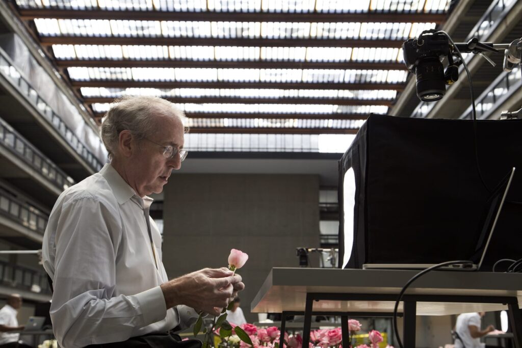
SARAH MEYOHAS
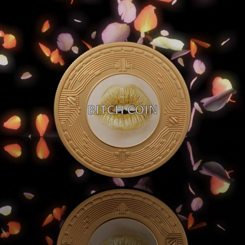
NB: When we first met and spoke in November 2016, you had already created the BitchCoin project and the Stock Performance takeover of 303 Gallery, where you traded stocks and artistically shared the immediate impact, or lack thereof. The stock changes were reflected in oil stick on canvas. How we conceive and understand value, and how it’s represented, is a central theme in your work. Can you remind us how you came to examine this intersection of the finance world and the art world?
SM: My background is finance so that was the first lens through which I was looking at the world. Then I went to art school. Art obviously has a relationship to value, whether it be economic, spiritual or cultural. It has a very complex relationship to value. Given my background, and given what I wanted to explore, value became this conceptual knot that I was looking to understand and untangle. Value doesn’t exist in a vacuum; it isn’t a standalone thing. It is a relationship, and it appears in exchange. In a void, there is no such thing as value. An exchange is a play of substitutions: one thing is in the place of the other, and that is ultimately a representation. The reason that art has to do with value, and therefore has to do with currency, is that currency is the representation [of value] that circulates.
I was reading theory — “The Currency of Images” — and thinking about value, very abstractly, from that side of it. I was also thinking about value very practically, in terms of things like our economy and how values emerge from that in a global system. I was developing BitchCoin in 2014, after I had heard about blockchain and thought it was an amazing construction of value, that didn’t rely on the force of government. Blockchain was a completely new concept. The metaphor of gold was also very interesting, because that relates to both the blockchain and art. Bitcoin, as a coin that’s mined, goes through an exertion process to get the output; that’s how the currency expands. Art, obviously, has a very strong relationship with gold. Gold is at its base an artistic material that was only used for cultural purposes; it didn’t have any other purpose, and that’s why it became currency.
So, in doing the operation of linking the two, I wanted to make my own currency as an artwork, and I wanted to make it hyperfeminine as a statement. I decided to back it with my own artwork — to give it some sort of value — and that’s where I came up with the Speculations series. The visual motif of the Speculations is the metaphor for the blockchain; they’re blocks that go on infinitely. It’s the same play on words — specular relation — it’s about an image of an image of an image of an image. It’s a constant exchange, with the image as the operation of the three dimensional thing appraising itself in two dimensions. It’s an operation of making a value of something. It all turns into a kind of soup of concepts — values and reflections. The fundamental thing that I’m doing is connecting — whether it’s blockchain, the public markets, big data or the cutting edge of augmented reality tech — to identity, and to a body (the most subjective things in life) because they’re actually just related.
NB: In your September 2021 artnet op-ed, you address the differences between BitchCoin (which predated Ethereum), and Damien Hirst’s project The Currency. What are your thoughts on gender, and gendering, in the crypto space? What has been your impression of the recent surge in NFTs, and the crypto space in general?
SM: In terms of gender, being in the NFT space — it’s tricky. The crypto space is about anonymity; people are anonymous on crypto. To a certain extent, your genetic makeup is unimportant. That’s not what it’s about. It’s not about who you are in the real world, it’s about what you’re like in the metaverse. To some extent, that is really refreshing, because it does feel like — in the real world — my genetics have way too much bearing on how people judge my identity.
In crypto, you’re anonymous, and that’s a breath of fresh air compared to identity in the real world. The downside is that most of the audience is men. It’s just the reality. The people who are buying NFTs — they’re traders and they’re crypto investors. Even if they don’t know who you are — and they don’t care if you’re a woman, a Black person or a trans person — the type of work that appeals to them [men, as the audience] is work that is very masculine. Think of the Bored Apes — this work is obviously very ‘bro culture’ masculine. Even generative art, as a concept and how it works, is fundamentally masculine. Maybe people will find this controversial, but it’s true.
There is a deluge of material out there, that in order to give value to an NFT you need to develop a community with a Discord, on which everyone is chatting and contributing, and it feels like you’re building some sort of movement. You need to constantly engage your audience, which is not necessarily what makes a great work of art. Great art is not consistently engaging you in a chat room. That’s why some of these projects aren’t really art; they’re cultural, collectable moments with aesthetic and artistic parts.
Then you have the generative art. As a cultural movement, people like to have editions where you can pick one (and one is better than another) but they’re all sort of random, and there is the element of rarity. This set-up kind of exists in the traditional art world. A painter makes somewhat similar works, and some are better than others, and you can make a sort of contest of which one is the better one, even if they look similar. Generative art is a crypto version of that. They have limited the tools of production to be a limited number of lines of code, and it’s all on chain. By limiting the tools of production, you’re allowing someone to display some sort of mastery with a tiny JPEG — that’s the movement of generative art. And it’s fine; it’s not a bad thing. It’s just, sometimes the results can be underwhelming. But I don’t want to speak ill of generative art — I think that out of all the things in NFTs, it’s one of the better things.

NB: In the relatively short period of time since NFTs have entered the mainstream, what’s your impression of the market, and this recent surge? In the crypto space you are one of the few women in this area, so I’m curious to hear your experience.
SM: I feel as though I’m in this odd Venn Diagram where I’m the only person who is in the traditional art world, in the crypto space, and is a woman. I’m alone in that convergence of the diagram.
NB: You’re the poster child for women in the crypto crossover space!
SM: I am and I’m not. The original work was a conceptual work where I proposed a system as an artwork, embodied it, and later invested in it. I didn’t come from the digital art space. The Venn Diagram then, by adding in ‘Conceptual Artist,’ becomes smaller and there really is no one else. But, I’m not a poster child, I’m just a weird outlier. The poster child is someone like Beeple. He’s a poster child for the NFTs.
NB: What has it been like?
SM: It has been fascinating. The thing that’s amazing about NFTs is that you’re selling something for which someone doesn’t necessarily need wall space. It’s the revenge against painters — all the time, everywhere — making more money than anyone else. It’s revenge! Finally, the weirdos can thrive! That’s the amazing thing. Normally, if you just collect for the love of it — with no thought or concern about where you’re going to put it and deal with it — you are in a very small, very amazingly privileged group. With NFTs, if you’re someone without a large apartment, you can still have a collection. What I hope for NFTs is that they end up bridging to the physical world, and allow for a separation of the stewardship of the physical asset from its ability to have some sort of financial value.
NB: Have you explored that in your work? BitchCoin has the physical piece that goes with it, but in terms of a display process for the NFTs, is that something you’ve looked at?
SM: Displaying the coin? No. Some people do choose to display the coin — I’ve seen it displayed in a residence. The longtime benefit of painting has been that it’s portable, archival, and easily comparable. For all of the art that is not like that, it’s very difficult. I think people should start making NFTs and start linking them in legal ways to physical artworks — but not linking just to another painting. It should be with things that can’t otherwise move, for example.
The NFT market is on fire. Communities are being built around it. It’s a new type of collecting, and the collectors value different things.
NB: It’s a different type of collector, too. The people who are buying NFTs don’t necessarily know the names Judy Chicago or Gerhard Richter. And those names might just not be relevant to them. I do liken NFT culture to sneaker collectors. It’s very much driven by community, the culture of likes, social media followings, and the persona that is ultimately built around the identity of the artist. This is why you see so many of these collaborations happening with Steve Aoki or Paris Hilton. It’s about how many social media followers you have, which can ultimately drive up the price. Could you tell us a little bit about your Cloud of Petals series, and the incorporation of artificial intelligence into this project? Could you also speak to the role of gender in this series?
SM: It’s sometimes hard to articulate the Cloud of Petals because of its physical and conceptual breadth. It feels so all-encompassing that it’s hard to summarize one part of it. The mechanics of it are somewhat straightforward: 16 men, temporary workers, all male. Male hands, picking apart [flowers], in a way an act of judgment and somewhat an act of violence. But they’re doing it kindly, and they’ve been told to do it — it’s their job to do it. They’re picking apart and photographing 100,000 rose petals in the former Bell Labs. Fun fact: some of the beginnings of blockchain, one famous paper that Satoshi mentions in the bitcoin white paper, that famous paper was developed at Bell Labs. So, Bell Labs is kind of the source of it all.
NB: It has come full circle!
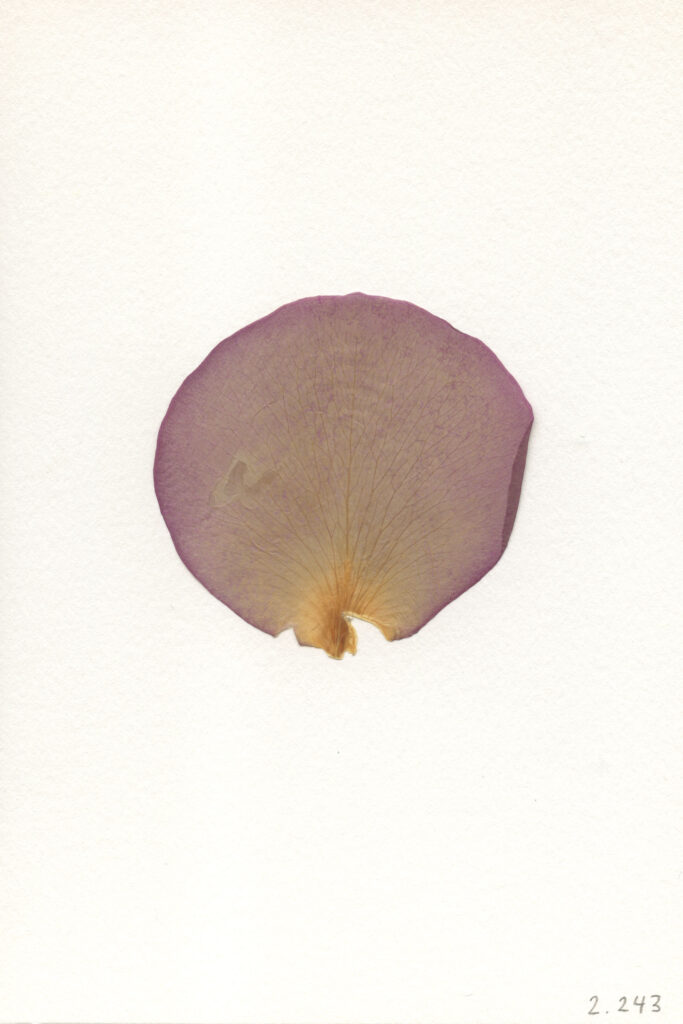
SM: Yes, really full circle! This is a giant proof of work. These men are photographing 100,000 rose petals, and then they pick one petal per rose that they consider the most beautiful. At the time I did that, I wanted part of it to be a physical relic. A lot of this is about trying to locate the truth at its most fundamental level. At a high level, it’s about automation and AI as trends: where do we locate beauty and subjectivity? But, at a deeper level, it’s really just about truth and ‘the record.’ There are the photographs; the films on 16mm, which has a completely different way of recording; there are the pressed petals, which are the relics; there are the digital petals that turn into the AI experience of the petals, which is it’s own truth, too. In terms of a Platonic ideal of ‘what is a petal?’ and ‘what are petals?’ that then gets substantiated a gazillion times. The project has to do with the sublime, and the specific sublime of hyperobjects and big data. The nature of photography as it shifts and turns into data; that whole element is part of the project, too. The project also partially mimics the world, especially given the narrative — which is now changing — of how companies should function. At the time of the project, these companies harvested our data to feed our desire back to us. I was essentially doing that same process, but with rose petals. A lot of my projects take things to an extreme. Now, the promise of Web3 is that you’ll be in control of your own data — there won’t be a centralized hosting platform. This project [Cloud of Petals] was very much Web2 inspired.
In a sense, it’s a perfect tie to BitchCoin, because that was backed by the Speculation photographs. There was a funnel process: making 100,000 new photographs, and then the resulting BitchCoins that come out of it are the relics; the pressed petals. The elements that have gone through the entire proof of work process to make it completely deflationary. Nobody wants a BitchCoin currency that goes on forever. Cloud of Petals is essentially the method to get BitchCoin (a fork of bitcoin) to Ethereum in an artistic way.
NB: What’s coming up for you? What other projects do you have going on, what’s next?
SM: I have a few projects. I’ll have a solo booth at Untitled at Art Basel Miami, with new AI petals and photographs. I’m making holograms, too.
NB: Is it with a gallery?
SM: Yes, it’s with COUNTY gallery, they’re based in Palm Beach, so this is their home turf!
In mid-February, I’m going to have a show with Nahmad Projects in London. That show is about my work around structural color, meaning, how birds and butterflies create color, and different instatiations of that.
One will be a piece in HoloLens (Microsoft’s Augmented Reality software), with a physical player piano. In augmented reality, there will be birds and watercolor effects that land on the piano and trigger it to play. There will also be sound spatialization that tracks the bird’s flight. You’re composing the birds and the music together.
Another piece that I’m working on uses diffraction grating, which is the glass used in Hololens. Diffraction grating is glass that has been etched 3000x per millimeter, so it refracts light and creates structural color that shifts when you move. Any grating can really be any color, it just depends on the angle of light, and the angle at which you’re viewing it. This is used in all sorts of optical devices — in airplane displays and in military technology — but I’m using it to create artworks. I will also put photographs into diffraction gratings.
The third work is that I’m also making holograms. It’s funny; it’s not as political or economic as some of my other works, it’s just more about pushing the structures of technology and what we can see. For the holograms, I made some super macro shots of plants that start to look quite hairy and weird.
NB: Just out of curiosity, do you have a studio where you produce your works? Or do you do this all on your laptop?
SM: I don’t have a studio, and I don’t think I will ever have a studio. If anything, I would have a place where I keep things. The truth is, even for my photographs, I used to use a studio and make my photographs on my own. This summer, instead, I went to Paris and worked with a few people. We rented one of the professional fashion shoot studios, with all the gear. Normally, the fashion shoots would be for one day. I went in and rented the place for a week, and did a full intensive! I got a much better work product than I would otherwise, being on my own in a studio. One day, maybe I’ll have a space. At this point, I don’t think that’s my plan.
October 4, 2021
Artist to Watch
TRUDY BENSON
NB: Congratulations on your most recent shows, and your upcoming solo show at Miles McEnery and concurrent solo show at SUNNY NY. You’ve clearly been very busy over the past years, so how have you stayed creatively inspired during these surreal pandemic times?
TB: Thank you. Yes, this month I will open two concurrent solo shows here in New York, both entitled WAVES. My solo exhibition at Miles McEnery Gallery will open on October 21 and run through November 27. The show will be at their 511 West 22nd Street location and will consist of all large scale paintings, including six 77 x 66 inch paintings. At SUNNY NY, the show will run from October 28 to December 11. SUNNY NY is a very young artist-run gallery in the East Village, so WAVES at SUNNY NY will have a bit of a different feel to the big Chelsea show. There will be seven paintings at SUNNY NY, as well as a site-specific wall painting/installation and five or six works on paper.
Regarding staying creatively inspired during pandemic times: there was definitely a window of time when I simply could not paint. When that passed, the studio was there waiting for me as an escape. I think that as artists, we have a slight advantage over some others, in that we are used to spending long hours holed up in the studio alone. When the world stopped and time seemed to stretch out eternally, I began to slow things down in the studio. As a result, the time in the work changed, and I felt that I could really take my time editing the work. The bug under the microscope feeling was gone. I am lucky enough to have a supportive partner who is also an artist, so we both found comfort in painting.
I’ve always been inspired by my surroundings, no matter what they are. It almost doesn’t matter where I am or how much I can consume. For example, the recent paintings included in WAVES, were initially partially inspired by my daily crossword puzzle habit. I sometimes take a photo with my phone of the finish screen that shows up on my iPad when I achieve a new time record. A weird screen interference started to show up, kind of a moiré pattern overlaid the very orthogonal check graphic. And so, the warped check airbrush layer was born. I am like a Shibu Inu in that I am happiest when I have something to solve. I think about the paintings in this way, also. I don’t plan them out from the beginning. Instead, each move is a response to the current state of the painting.
NB: Can you speak to how you view the processes of collage and paint interacting within the scope of your work? How is the color palette determined for each work?
TB: I visualize the work as almost an illustration of a collage. I want the layers to feel tangible, to feel almost as though you could get into the painting and move things around with your hands. (Please don’t actually attempt this!) The different methods of paint application help to reinforce the virtual space in the work. The sprayed acrylic absorbs into the raw canvas, and the blurred edges help to push it into the background. Certain areas are built up more, whether in acrylic or oil paint, to push those layers forward in space.
Regarding color palette, I usually have a very vague idea of palette when I begin a painting, and then react to that as the painting progresses. Nothing is planned out beforehand. Most of the decision making happens on the canvas. I use color to create tension at the surface as well as optical effects.
NB: How have the digital age and computer software influenced and inspired your practice?
TB: I still think about the work in terms of layers. The shallow space the paintings inhabit definitely has its origin in digital imaging. My first attempt at an abstract composition was on my dad’s desktop computer at a Bring Your Daughter to Work Day. We also had an old Macintosh SE lying around at home with the MacPaint program installed on it. I remember the tool bar with fondness: suddenly I could conceive of using a spray can alongside a gradient and a paintbrush.
Earlier paintings were almost quoting this nostalgia. I think my recent paintings have reinforced their own materiality, while maintaining this entry into abstract composition. To see the works in person, there is so much more than the digital reference. The paintings are human-sized or larger for the most part, and completely hand-painted. I don’t use projectors or digital printing in my work. At this point, I think the digital age is more of a reference point for the work. At heart I am a painter, a grungy studio rat.
NB: I read that you participated in the 2021 group exhibition Her Dark Materials, curated by Philly Adams at the Wolverton Works Virtual Art Museum, Buckinghamshire, UK. Can you tell us a bit about the process of participating in a virtual exhibition, compared and contrasted to your experiences with in-person shows?
TB: Having exhibitions during a global pandemic has changed my relationship to the paintings a bit. I always felt that seeing the work in the gallery space really helped me to see the paintings in a new way. I’ve since had two solo exhibitions overseas that I never got to see.
Her Dark Materials was special in that the space was beautifully rendered virtually by an architect (I believe). There was a haunting video created to move the viewer through the exhibition. It is kind of magical!
It is a beautiful thing to still be able to “exhibit” paintings during a time when shipping could be shut down at any moment and we cannot physically gather or it is unsafe or unwise to travel. However, I fully believe that art ought to be experienced in person. Without going to the place the work is to be exhibited, the paintings almost don’t seem to be finished. There is a big difference to how a painting is perceived by the artist in the studio versus in a gallery space where installation and the venue is taken into consideration.
NB: Would you be able to share any information with us about upcoming exhibitions or projects you’re excited for in the next year or two?
TB: I will have six small paintings as part of a presentation with PLATFORM, David Zwirner’s online initiative, sometime in October. I also have a series of works on paper to be exhibited in my dear friend’s vitrine space in Brussels to open late October: Massif Central is run by the lovely Tessa Perutz.
I will have a couple of two-person exhibitions with my partner and fellow painter Russell Tyler: Mother Gallery in Hudson, NY early summer 2022; and Gaa Gallery in Cologne scheduled for late fall 2022.
August 24, 2021
Artist to Watch
THEODORE BOYER
NB: What are your earliest memories of interacting with or experiencing art?
TB: I think it was when I was really little, probably my youngest son’s age — four years old. I grew up in Orange County, just south of Los Angeles, in a suburb. My cousin and Grandmother lived in Morro Bay. When we would come up to visit them, we would drive through Los Angeles up the 101. I would see the murals [created for the 1984 Summer Olympic Games] by the Disney Building. It’s the same murals there now as in the 1980s. It’s amazing. In Glenna Boltuch Avila’s L.A. Freeway Kids, there are these little kids and there is one playing basketball. On the other side, there is the mural of Lita Albuquerque, from Kent Twitchell’s 1983 7th Street Altarpiece, across from a work by Jim Morphesis. It’s amazing, and it really stuck with me. As a little kid, I was wondering — what is that?! I ‘got’ the murals and the things that were more obvious — like graffiti — but that piece really stuck me.
NB: Let’s talk a little bit about your work. What are the different themes you explore, regarding identity, belonging, sense of place? Can you talk about how these influence your work?
TB: I was adopted, and that plays a role in my identity issues. I hadn’t really known who my [birth] parents were for a really long time; I never really knew where I came from. It never really struck me, until I started creating art (and talking to my therapist) that these were serious, deep-rooted things that I needed to explore and deal with. Throughout the last 10 years, since I’ve been seriously making art, I have been going back to this theme of death and rebirth. It is an ancient, ‘as above, so below,’ masculine feminine alchemical thing that really, to me, starts at birth and ends at death. The way that I have worked is by starting with abstract paintings that represent various primordial things — focusing on the background in the abstractions — then moving into more common themes like evolution, for example, or astrology or astronomy.
NB: How did you become inspired to incorporate science and nature so centrally in your creative practice? Could you also speak to the different series that you’ve been working through?
TB: Science and nature have always been a part of my practice. I’ve always gone back to the ideas of spirituality, reflecting on the cosmos and the primordial being, the origins of humanity, and evolution. I worked in the abstract for a while, dealing with cosmology, astronomy; looking at stars and thinking about navigation. As it evolved, over the last couple of years especially, I have been moving into more figurative work. This transition has stemmed from my personal experience; my personal journey through life.
NB: I can tell from your work that you’re very interested in the history of painting. Who have you been looking at, in art history, that has influenced the different series of your work?
TB: I am always looking at art and artists. Many, many different artists (and things!) influence me: Sigmar Polke, German Expressionism and Alice Neel, [David] Hockney, Marlene Dumas among others. The artists that I am influenced by have such a wide range — just thinking about the contrasting practices of Alice Neel and that of Robert Smithson. There is so much art that goes into my subconscious and gets cycled around, and then translates into my little formulas that I have when I paint.
NB: Can you speak to those formulas a little bit?
TB: I start out with the abstraction. That comes from different imagery of space explosions, chaos and cataclysms. I have several books in my studio where I collect inspiring images to have them constantly visible and circulating, so I keep them in my subconscious. I’m constantly looking at various things. I have a vast library too. I am always looking at images that reference what I’m painting — even the abstractions. I use that as a background then I move into different techniques. Right now, I’m working on mostly figurative pieces. Essentially, I’m collaging the ideas together.
NB: Could you speak to your series Rainbow Cataclysm? Do you have other projects coming up, or new series that you’re working on?
TB: The Rainbow Cataclysm is, again, a sort of collage of my acquired tropes from over the years. The real core concepts are: human origins, death, and rebirth, which are the overarching topics that I deal with in most everything that I create. Like ‘the chicken or the egg,’ everything starts at some point, right?
Things culminate in one moment, then die, then come back — possibly as another thing? That is the on-going theme. I’m looking at flowers, I’m looking at still lifes; I’m looking at things that decay and devolve. I am also looking at the human experience, as well. These flashes of time that happen over the course of eternity. What I’m exploring in Rainbow Cataclysm is a subconscious flashback, in many ways. The idea of a cataclysm, in and of itself, is that every civilization comes to an end at some point, and then it’s reborn and turned into something else. Those concepts exist on a macro level and also on a micro level. I’m working on the microcosm of this experience now. I’m looking at organic matter that decays over time; the human condition; relationships; things that start, blossom, and come to an end — in one way or another.
I have a couple of upcoming projects. One is a show in Hong Kong called Techno Lust that is curated by Ben Lee Richie Handler and staged at W.O.A.W. Gallery which I’m putting together right now. It’s a group show, and I’m doing an installation. Some of my Star Map paintings will be presented as wallpaper, covering a whole room — in a psychedelic way — then paintings will be hung over it. I will also show a couple of paintings, alongside many cool artists. That show will be at the end of August. Then, I am going to Istanbul for a residency at Sevil Dolmaci Gallery in mid-September where I will also be exhibiting paintings for a show curated by Dr. Kathy Battista. I’m very excited about that! In the first week of October, I’ll be in Crete for another residency at Elounda Island Villas. The residency is run by a Greek artist named Leda Alexopoulou. I was introduced to her through Viennese curator Anne Avramut – who has a background in archaeology. She contacted me about my new still life paintings. Being that the flowers are painted in these different Greek, Etruscan and Minoan pots, Anne thought it would be cool to connect me with Leda and experience Greek culture and history first hand. With Covid, everything has been locked down for the last few years. This will be the first or second time I’ve been on a plane. It feels like things are getting back to normal a little bit. Hopefully, new art will flow again! Prior to the Star Maps series I had been working on figurative paintings — it was mostly dealing with narratives surrounding history, ancient cultures and archaeology. I was super lucky to have studied in New York and Zurich, where I had access to some of the most amazing museums and collections in the world. During those years I was able to catalogue artifacts and relics that would appear in my work much later. Although in the past five years I’ve been exhibiting mostly abstract paintings, I was also painting small figurative studies for my own enjoyment. It wasn’t until a couple of years ago that I would publicly show them.
NB: Did you find that the time during the pandemic greatly influenced your work, and the type of work that you produced? Did it change the type of work that you produced? Or were you just trying to just survive, with two kids at home?
TB: Yes, I mean, honestly, going back to the studio was like my sanctuary. I felt really fortunate to have had the studio space, and to have been able to keep it. At that time, I had been working with several galleries and I then went completely independent. Around the same time I was having somewhat of a personal crisis, which I also feel very fortunate to have come out of. After that, I started making work that was more related to what I was dealing with, right then and there, such as the loss of personal relationships and friendships. I also looked at my family; my wife and kids — using them as my muses — and portraying them in my work, which I had not done before and that was a big reckoning for me.
It was a confirmation of the things that really do influence me, and my life, all the time; they need to be in my work at this point! I also started painting portraits of friends of mine — people that I hadn’t seen in 6 or 8 months. Until then, we had just been following each other on Instagram, and making do. Usually, I would have people come over to my studio, and invite people who I would want to paint, and do a portrait from life. Since the pandemic began, I wasn’t able to do that. Most people were worried about Covid, and it was just too much for a lot of people. Instagram was really the only outlet to look at art; all the museums were closed. All the galleries were closed for that period too, so I looked to the internet, collecting images; putting together these image archives. I was also painting portraits of people who posted their pictures on Instagram.
NB: Definitely, it’s the way to connect in the absence of human connection. Back to figuration!
TB: Exactly, back to figuration! Now, I am still working on the Star Maps and abstractions, but I am also bringing people into the studio now and doing portraits from life which always keeps things exciting.
June 29, 2021
Artist to Watch
ANDY MISTER
NB: You received your MFA in Creative Writing from the University of Montana, in addition to studying English Literature (and Philosophy) during your undergrad years at Loyola University in New Orleans. Can you speak to how your studies in this area influenced your art and your creative practice today?
AM: I was really into the visual arts, and into making art as a kid. As a teenager, I went to an arts high school. I wasn’t a huge reader until the end of high school. I didn’t really know what to study in college, so I just signed up as an English major. Taking English classes in college taught me how to think critically, I don’t think I had ever really thought critically before that time. It really opened my mind up different ways of thinking about language and information that I just had never really considered before. I think it might have been in my first English major class — our professor asked each person in the class to explain the difference between a window and a door. And it’s really hard to do! You can do it in a utilitarian way, or you can describe it physically, but it’s really hard! A lot of times, the way you describe a window and a door it sounds like they’re the same thing. As an 18 year old, that slipperiness of language really struck me. That really opened up a lot of ways of thinking, for me, that I hadn’t encountered before. For my MFA in Creative Writing, my specification was poetry. There is this famous story where Edgar Degas was talking to the poet Paul Valéry, and he said to him “I am going to write all of these poems. I have all of these great ideas. I have so many ideas that my poems are going to be great!” Paul Valéry famously replied: “well, poems aren’t made out of ideas, they’re made of words.” In the visual arts, similarly, a painting or a drawing isn’t made of images so much, or even ideas; it’s made of material. For me, my drawings are made of marks. In my work I try to focus on mark making in the same way that words are the fundamental element of writing.
NB: I never really thought about the artist’s process of mark making as being intertwined with the words of poets, and I see there is a very interesting parallel there. Poetry has been so integral to the visual arts — thinking of artists like Kiefer — it is always there.
A lot of your work examines the process of appropriation. Can you talk a little bit about that, and how the works question the way meaning is either created or lost throughout this process of appropriation? Can you tell us a little bit more about what drew you to investigate this topic?
AM: For my generation a lot of the music I listened to as a teenager involved sampling, taking pre-recorded pieces of music and stitching them together to create something new. Also, a lot of elements of the design world (also around music) involved appropriating film stills, and things like that, in graphic design. Before I knew that appropriation was a thing in the arts — the Pictures Generation comes to mind — through osmosis, I had already accepted these ideas of appropriation that perhaps my parents’ generation would have found questionable, or they wouldn’t have considered a real, original piece of art. For me, it was natural. Later on, when I did find out about the Pictures Generation — Sheri Levine and Richard Prince — it didn’t have to be explained to me, it was just obvious. In my own work, I consider all this visual material, whether it’s photographs that I take, something created from life, or something that I find — it’s all grist for the mill of your artistic process; there isn’t a hierarchy. In my writing and my art practice, I’ve always felt that there should be a democratization of source material. I feel that same way in my own work regarding the images that I choose. They’re all of equal importance, there isn’t one image that is more important than another. It’s just a question of how you use the images, and how — when you present it to an audience — people bring their own experience to the work and interact with it.
NB: In terms of the images used in your work, drawn from outside sources, what attracts you to certain images, and not others? I know you just touched on this a little bit.
AM: A lot of the work that I was making at a certain point in my career was socio-political, or historical. I was interested in different historical moments, and I would then research and look for specific images that represented those moments. For example: using a photojournalistic image from the Vietnam War, cropping out a weird detail from it, and blowing it up. Similar to the Michelangelo Antonioni movie Blow-Up. Expanding the image into something new that isn’t recognizable from the original. Back then, the subject matter was important to me, even if it was somewhat obscured in the final piece, or in the process. Over time, I became a little less interested in the historical placement of an image, and more interested in the immediate aesthetic enjoyment of images. I started thinking about taking Pictures Generation moves, or relationships to images, and connecting it back to more classical art historical references. Using content like traditional landscape, or traditional still life, but instead of replicating them from life, or en plein air, finding old photographs and again manipulating and translating them into drawings and paintings. That is how I interact with the images now. I try to find a feeling that I get from a sourced image. I then scan it and try to heighten it and crop the photo to make it into my own thing; I then further make it my own through translating it by hand.
NB: Is it drawing, is it painting, or is it a mixture of both?
AM: I’ve gone through a few different material processes. The majority of the work that I do now uses watercolor paper that I paint washes on, I will then use carbon and charcoal pencils on top of that — and sometimes pastel — to draw an image. As the final step, the paper is mounted to a wooden panel, so it’s not framed and will instead sit on the wall like a painting. It is in this liminal space between painting and drawing, which I feel lets me have the best of both worlds. I really do enjoy drawing, and I enjoy doing things by hand, but I also like a lot of the material elements of painting, such as texture and form, that you don’t totally get with drawing. There is almost a three dimensionality that you lose with drawing. Originally, when I went from making paintings to drawings, I was making graphite pencil drawings on paper. It was exciting to pare the materials down like that at first, but then I became interested in figuring out a hybrid of painting techniques and drawing techniques.
NB: Can you speak to your two most recent residencies, the Lower Manhattan Cultural Council in New York, New York and the Bemis Center of Contemporary Arts in Omaha, NE? How were these experiences? How did they foster growth, creativity and opportunity for you as an artist?
AM: They were really great. I didn’t go to graduate school for the visual arts; a lot of people that I know, especially in New York, came with a built-in group of people with whom they attended graduate school. I do feel like that is one thing I did miss out on. Doing residencies was my first glimpse into what that sense of community in making your work is like; meeting other people who were making very different work, with very different ideas about art making, and bouncing my ideas off of them in a structured setting. It was really great. At the Lower Manhattan Cultural Council (LMCC), I did this project where I drew a drawing of a different political figure every day of the presidency. It was eventually made into a book called Heroes and Villains. I had some ideas like that, to create conceptual pieces, but I had never really had the means to actually make it happen. And LMCC gave me the space to do that. The Bemis Center was also really great; it’s in Omaha, Nebraska. It’s a really beautiful building with really amazing studios, they give you a stipend, and you go there for three months. At that point, I had been working a lot of day jobs and creating work at night and on the weekends. My time at the Bemis Center was the first three month stretch of uninterrupted art making that I had experienced in years. Right after that, I did a solo show at Geoffrey Young Gallery in Great Barrington, Massachusetts and I had created the work for that show at the Bemis Center. That whole period was a really great time for me.
NB: Can you tell us a little bit about what you have upcoming in terms of shows, residencies or projects?
AM: I just had a solo show close at Rebecca Camacho Projects in San Francisco. And now I am making work for my next solo show, at Lowell Ryan Projects in Los Angeles. It opens in February 2022. They have a really beautiful new space that has these amazing high ceilings. I am making some of the biggest mounted panel pieces that I’ve ever made for this show — they’re around 60” x 80” so they’re pretty big! It takes a lot of time to make pieces that big, so most of my energy is going into that right now.
June 2, 2021
Artist to Watch
DOMINIC CHAMBERS
NB: Can you share with us a bit about your experience with art as a younger man, leading up to your time at the Yale MFA program?
DC: Growing up, I always had a fondness for drawing. Mostly recreating characters that I saw in cartoons or in anime. I was a huge anime and comic book fan. I tried to find every opportunity to draw something. My love for drawing coupled with an incessant need to create something was heightened as I took frequent trips to the St. Louis Art Museum during school field trips. Like most black youth in impoverished neighborhoods, I couldn’t imagine a sustainable life in the arts. So, I decided that I was going to keep my artistic sensibilities to myself, maybe write short stories or write plays and keep them to myself. But I was dating a girl who told me that if I didn’t go to college she was going to break up with me, so I enrolled at a community college where I was exposed to the critical discourse present both in art history and the contemporary art world. I felt like I finally had a space to participate. From there on out, I learned about the Yale MFA graduate program and the Yale Norfolk School of Art residency. I set my sights on those goals because, in my mind, coming from a lower income family in the northern part of St. Louis, there was no middle ground for me to be okay; it was either, you stay where you are, or you go on to achieve the best. Having a naturally competitive and ambitious spirit, I decided that I wanted to be included in dynamic conversations and have my work respected by the artists and institutions that I came to appreciate.
NB: That is impressive, really impressive. Can you share with us a bit about the subjects in your figurative work? If you could also speak a little to your process, it would be great to get that context.
DC: A lot of the subjects in my paintings are all friends of mine. They are mostly friends that I met in graduate school. The idea, in a way, is that the paintings are a timeline of my life; the subjects grow up. There are collectors who have paintings of me with my long hair, then there will be other [collectors] who have [works] of myself with short hair now. So, in a sense, I am a living subject in these paintings. The process is really one of community. I will reach out to my friends and ask them to model for me, they are often enthusiastic to do so. I think that collectively, we have a shared appreciation of seeing ourselves in moments of leisure and rest. In that way my friends are very supportive of my project. I draw a lot; I’ll sketch some things out in my sketchbook. I’ll text a couple friends “hey, do you have maybe five or 10 minutes? I’ll come to you” and I’ll share with them my compositions and ideas. My friends are great, they’re flexible and willing to work with me. An old professor once said something that I never forgot: “the good thing about being an artist is that people assume you’d be weird anyway,” so you can just be yourself. It’s been working out.
NB: What are your thoughts on figuration and abstraction? We’ve seen the two approaches intersect really beautifully in your work, particularly in the After Albers series. It would be great to discuss this from an art historical perspective.
DC: When I first started painting, I took foundational courses which focused on painting from observation. While at the Milwaukee Institute of Art and Design, I made a lot of minimalist, abstract paintings. My paintings were just one color; they were all about my relationship to color. There was no image, the work was all about surface, color and very objective approaches to making a painting. As my process evolved, it made sense that the abstract elements followed me into my figurative work, even if you consider my relationship to the color in my current paintings. It’s certainly a byproduct of my past investigations and love for color and color theory. I understand I can capture a color without too much fuss – I’ve been exploring color for such a long time. With regards to the After Albers series – they take inspiration from Josef Albers, the modernist painter, and his homage to the square paintings, in addition to his theories concerning color. I think that in society, we kind of treat bodies like abstractions anyway, so, for me, there was this beautiful symmetry between our bodies and what we perceive to be our identities — as our identities are contextual. Josef Albers’ investigation with color, and color being a product of relationally; Our understanding of a given color is relational. The idea is, that if you were to orient two colors next to each other, they could influence one another and consequently affect the eyes’ ability to interpret what it is that we’re looking at. The two colors can change; they could even create a third color entirely. In a way, we are like those colors and I found that my body and my identity function very similarly. My Blackness has a particular cultural and social specificity attached to it in the context of America. But if I were to go to Africa, my body would be read in a very different way; because the racial logics and paradigms are different. Art historically, that’s where I was pulling from, but merging the concerns and examinations of Josef Albers’ objective exploration of color relationships with the contemporary concerns surrounding identity politics that we’re all currently negotiating.
NB: I have never heard anyone speak to Albers and identity politics in such an artistic way.
DC: When it comes to the figurative works, too, I am utilizing palettes from Josef Albers paintings. I’ll have a stack of color swatches, I have hundreds of them. I try to get the colors as correct as I can, as close to the Albers paintings as I can. They’re not in front of me, of course, so I have to rely on my own color sensibilities. I’ve studied the history of color, in Marcia Hall’s book Color and Meaning, and brought in different painting strategies that I thought, within the high and low Renaissance, would compliment the modernist aesthetic of Josef Albers, or, as it relates to my paintings. Josef Albers paintings are singular swatches of color, mine are figurative, which means that the use of color would be expansive. I thought to myself “How can I create harmony with color that creates a dynamic image but doesn’t lose the monochromatic flatness of Albers painting.” So I started thinking about different modes of painting such as unione, which is used, historically, to create harmony while not losing the chromatic integrity of a color. It has been good for me to think of the color spectrum that Josef Albers was working with — for example, Albers paintings are three colors. Of course, when I engage with a body, there are different shadows and shapes that compose the body. Utilizing unione makes the most sense for my approach in solving that problem, because you’re creating harmony. You would work from the middle of a color, and you expand out. They are drawing a contrast in those paintings. If the outer rim of a Josef Albers painting is a teal blue, or an ultramarine blue, utilizing unione, I can work from that blue and create a sense of harmony so that the product the viewer sees in my paintings, still looks as though it is a solid, framed color.
Basically I minimize the color spectrum, to a degree so that there aren’t any jarring contrasts. It’s great for getting a huge range of values for something as flat as [one specific shade of blue]. That is one way I’ve been approaching it, along with maintaining a more critical eye for how I am building out the figures as they relate to, or are an homage to, the square composition. Sometimes the figures are sitting down, because I am thinking about their arms, and thinking about how their body can create a shape within the square format, as well. There is also this play between the body itself becoming a form of abstraction. If you consider a painting like After Albers (Seeing Through the Dark), you’ll notice Kevin’s body becomes a triangle, in a sense, because we’re looking over his shoulder.
NB: Is that Kevin Brisco?
DC: Yes, it is! In the most recent After Albers painting I did, Seeing Through the Dark, you’ll notice that Kevin’s body becomes a triangle. There is a play between both the figure and ground reversal, as well, but utilizing the body also to add an extra element of abstraction to the painting.

NB: Could you speak a little bit about how that color theory process also extends to your Wash paintings?
DC: The Wash paintings were born out of my interest in this idea of the ‘veil’ that W.E.B. Du Bois talked about in his book The Souls of Black Folk. In addition to depicting images of black leisure, I am also concerned with critical history, art history and literary narratives. A lot of my work considers surrealism, and its literary counterpart magical realism. Because I often see the Black experience as being a surreal one. When Du Bois talks about the ‘veil,’ it’s essentially this metaphorical illegibility that’s cast over your character. This ‘veil’ is the curtain that separates the black subject from others and disrupts the opportunity to engage with said subject on equal and fair terms. For Black individuals, it is our skin that alerts others that we are different. A similar proposition, I think, can be applied to women: it’s also their body; it’s their gender. Often when men encounter them, their gaze is filtered through a patriarchal lens and consequently prohibits them from engaging with who that woman, as a person, could possibly be. Still, you don’t see the veil; you experience it. But through the lens of magical realism you could see it. That is what the Wash paintings attempt to address. You engage with these paintings that are these depicted scenes, but the splatter and the abstraction that ruptures the overall image is what we are engaging with, so, in a way, we are engaging with that ‘veil’: that illegibility, that curtain, that thin layer. When I make the Wash paintings, I’m using my body. I’ll often fill buckets of paint up and I’ll pour the paint on top of the painting, or I’ll slap them off; they’re much more physical. They have a different relationship with my body than the Primary Magic paintings or After Albers painting, which have a stronger relationship to my mind, because I’m thinking more (in terms of color theory).
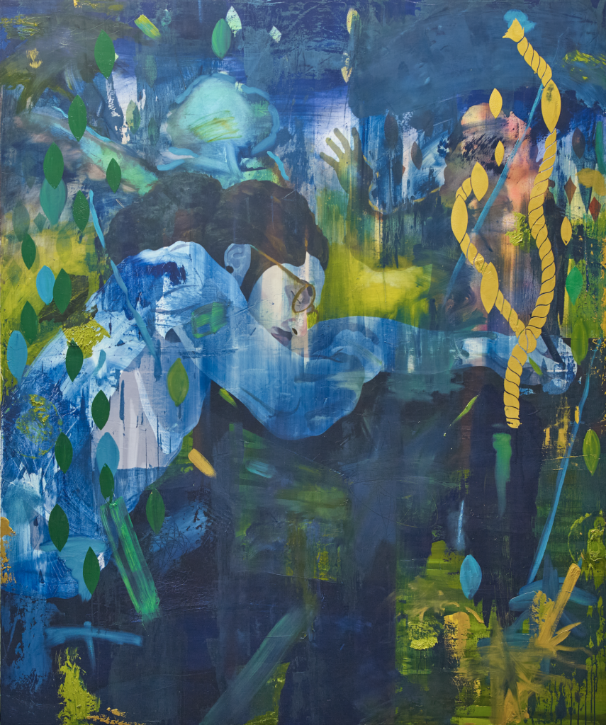
NB: Are there any upcoming projects you’re excited about? Also, I understand that you’re a collector. I am curious to learn about your thoughts for the remainder of 2021 in both areas.
DC: I have a solo show at the Luce Gallery in Torino, Italy. The title of the exhibition is “Life and Its Ghosts” and it is about my shift in reality. Over the course of 2020 to 2021 I have been struggling with this dramatic shift that has happened within my reality, both in response to Covid and my growing profile in the art world. I found myself navigating new spaces and engaging with very different people. My external reality has also changed; I never imagined I would have a studio such as the one I have now. But I am still haunted by the ghosts of my past; life and its ghosts. I can’t escape it; I have a lot of anxiety. I use that word ‘ghosts’ specifically, and it’s because a ghost is something that has the potential to be encountered again, there is some kind of veracity to it, there is a body or presence to it; and that’s what my past has been for me. It still somehow lingers within my everyday life, despite my leaving St. Louis; despite being in the later half of my 20s. The show will negotiate those things, amongst other familiar concepts I’ve been working with.
Collecting, for me, is really important. I really think everyone should be a collector; artists are cultural producers. When you are collecting, or when you’re going to a museum, you’re collecting someone’s intellect; you’re collecting that mind. When you go to a museum, you go there to learn, right? You’re engaging with the intellect of all of these great artists across the spectrum. For me, I am a lot less concerned (and I know the market is huge) […] Black figuration, Black portraiture, and more recently Black abstractionists who are starting to get a lot more attention, too. As a collector, I am less concerned with those kinds of trends. For me, I want to know what your research is, I want to know how an artist reads their subjectivity. I want to know how an artist considers their own relationship to the world. When I reach out to a gallery to inquire about a work, the first thing I ask is: can I read the artist’s bio, can I see their CV? Is there any writing around their practice? Because, if I want to champion you, or if I’m going to invest in you, I want to see what you’re capable of doing. I want to invest in your project, that’s my role as a collector. I want to invest in your ideas. For me, that is the thing that fuels my own collecting. I have a very uncompromising eye, so I don’t collect everything. Because I know everything is not great. I also understand that the market is very fast-paced and with the pace the market moves at, that oftentimes forces some artists to produce things they might not necessarily be the most proud of, but they’re trying to feed the market because, you know, we all have lives and bills to pay. A small sacrifice to keep things going? But, as for myself, I really do believe in collecting what you love, but also maintaining a very critical eye to what you’re going to be living with. For me, as a collector, I think about that quite a bit.
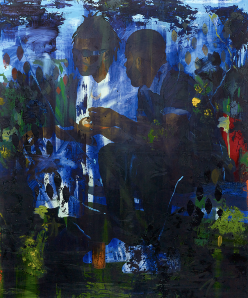
NB: Could you share what you’re reading at the moment? What’s on your nightstand now?
DC: At the moment I’m reading a couple of things: On Earth We’re Briefly Gorgeous by Ocean Vuong, The Daily Stoic by Ryan Holiday and Stephen Hanselman, and Quiet: The Power of Introverts in a World That Can’t Stop Talking by Susan Cain. Quiet was recommended to me by a friend and I’ve been enjoying the writing quite a bit. On Earth We’re Briefly Gorgeous is an incredible read! The writing is so rich. I read the Daily Stoic everyday, or at least I try to. There was a time when I was beginning to feel quite comfortable with my grief and sought out something to read, mostly as a temporary distraction and I came across a book on stoicism called the Meditations by Marcus Aurelius and I fell in love with its philosophical teachings. From there I ordered the Daily Stoic and haven’t looked back.
April 20, 2021
Artist to watch
ELISABETH KLEY
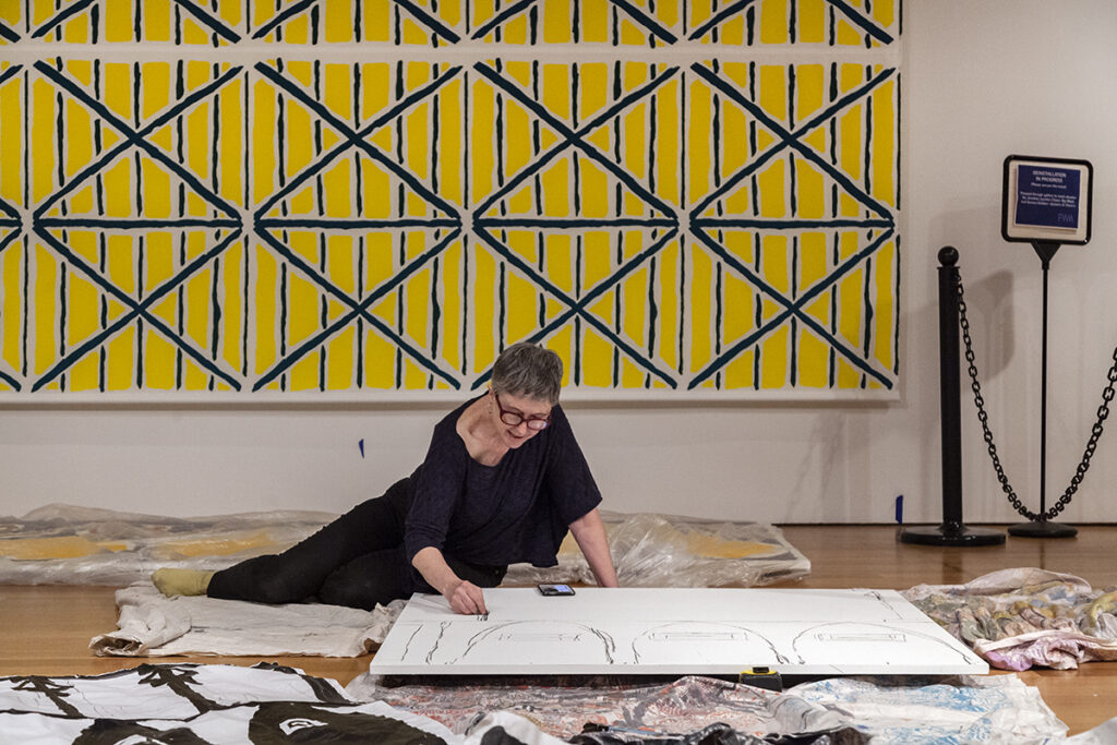
NB: Could you share with us your story of how you got started working in ceramics? Who and what inspired you?
EK: My start in ceramics was serendipitous. My husband wanted to start making terracotta sculptures. We needed to learn how to use a kiln, and decided to take a class at our neighborhood pottery school. The class didn’t fit my husband’s schedule, so I took it on my own. I had recently been inspired by the beautiful historical ceramics in the Musée de Sèvres, just outside Paris. Light poured into the galleries and the pieces all seemed to glow. I really liked the way the artists painted on the ceramics — the touch was so effortless and fresh. I thought perhaps I would make dishes to use, but I never did. Instead, I made small sculptures and vessels and my work went on from there.
I think a lot about world culture and art history. I am inspired by ceramics and textiles from Central Asia, Turkey, Syria and Japan. I also find inspiration in textiles from Samoa, Roman frescoes and mosaics; Ancient Greek and Egyptian art; Coptic, Indian, and Wiener Werkstätte fabric design; and Ballets Russes sets and costumes. Artists I look at are Matisse, [Aubrey] Beardsley, Annie Albers, Leon Bakst, Natalia Goncharova, Kees von Dongen and Beatrice Wood. Also, for more contemporary art, I admire Nick Mauss, Paul P., Marina Adams, Marc-Camille Chaimowicz, Chris Ofili, Etal Adnan, Kai Althoff and Betty Woodman.
NB: Can you tell us a bit about your studio process, and provide us with some insight as to how you develop the patterns and marks in your ceramics?
EK: I like to travel and go to museums. I have my iPhone with me, and I take hundreds of pictures. When I get back to the studio, I go through the images and make drawings in pencil and ink of whatever catches my eye — mostly abstract shapes and small details I find in pottery and textiles. I also use drawing to figure out shapes for the ceramics.
I make most of the ceramics out of slabs. I put the clay through a slab roller, cut the slabs to size and assemble them into three dimensional shapes.
Most of the surfaces are flat, so once they have been fired (to make them strong), I cut paper shapes the same size of each flat surface of the piece, paint different designs on the paper and tape it on the sculptures, as though I am dressing paper dolls. I keep changing the drawings until I come up with what I want.
After that, I paint the piece with white underglaze and I draw the design once, followed by a second coat of white underglaze, another better drawing, and a third coat of underglaze. Next, I paint wax over the places that will stay white and when the wax dries I put cobalt blue stain and black underglaze on the unwaxed areas. The pieces go back into the kiln; the wax fires off, and the design is set. Then I glaze them and fire on the glaze.
NB: How long does your process typically take?
EK: It took around eight months to make and decorate the eight sculptures included in the show at The Fabric Workshop and Museum. It takes a day or two to roll the slabs for each piece, another day or two to assemble the slabs, and then the sculptures have to dry for a few weeks before the first firing. Finding the right painting for each piece takes as long as it has to. The fabric took several months too, as I did a lot of different watercolor drawings before choosing the three final designs.
NB: Wow, that is fantastic! I’d love to hear more about Fountain with Arches and Nautilus Border (2019). How long did it take you to make that work? Can you tell us a little bit about how the work came to be? And — congratulations, it was acquired for the Whitney, which is very exciting! I remember seeing it in a gallery, and being blown away. I am thrilled it landed at such an important institution.
EK: I have known the artist Tabboo! for a long time and liked his paintings. I went on a trip to Rome and Naples with my friend Jacob Robichaux (who founded the gallery Gordon Robichaux with Sam Gordon, and represents Tabboo!). We went to the Naples Archaeological Museum, which is filled with the Roman frescoes removed from Pompeii. I have done several site-specific wall paintings for exhibitions, and Jacob and I started wondering what Tabboo! would do if he painted a mural. We dreamt up a show that would have a room with Tabboo!’s colorful wall painting on one side and a room with my black and white wall painting on the other side. I made the two fountains for the longer, rectangular space between the rooms, in front of a wall that was covered with Tabboo!’s blue/green drawings of plants with words. It was our version of a Roman garden. Jacob helped me construct styrofoam models to get the proportions right for the fountains. Then I made them, which took a few months.
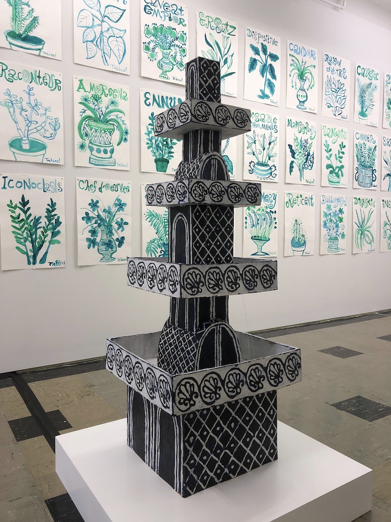
NB: Who did the plumbing work?
EK: Jacob! I sent away for the pumps, and the plumbing is quite simple. But since ceramic shapes can change during firing, it was a challenge to get everything level so the water could flow equally on each side. Jacob was patient enough to figure it out, using wax and coins to adjust.
NB: Was there ever a time when you were making your fountains that, due to inconsistency in ceramic, you had to start again?
EK: Yes. The big basins at the bottom were the hardest. I tried glazing the underside of one, but when I took it out of the kiln (it had been fired raised on stilts at the corners) it had sagged and bent; it wouldn’t sit level. I had to re-do that piece and leave the bottom unglazed.
NB: Why don’t you tell us a little about your exhibition at The Fabric Workshop and Museum in Philadelphia, Minutes of Sand? And what the title means.
EK: I have the catalog from a really wonderful Alfred Jarry show at the Morgan Library last year (which I actually missed because of the pandemic). I love Alfred Jarry’s woodcuts. The title is taken from his first published book, Les Minutes de Sable Memorial (Memorial Minutes of Black Sand). I had been thinking that I would maybe use some of his designs for my ceramics, but I wound up sticking with Egypt as my source because there was so much more to work with.
The show came about because the curator, Karen Patterson, had seen my work at the Independent Art Fair in 2018. I had done a solo booth with my gallery Canada, including ceramics, paintings on cloth, drawings and wall painting. When she started working at Fabric Workshop, she invited me to come and make colored silkscreened fabric and exhibit it with my ceramics.
I came up with a lot of ideas for the installation. I wanted the color to move through the exhibition. The fabric was silkscreened with three different designs, so there are three wall hangings, and three lengths of fabric placed on low wooden platforms, like rugs. There are also pedestals that I designed, in special shapes. When I arrived in Philadelphia for the installation, I did black paintings on the blank areas of the floor platforms and also on the pedestals. There is also a screen, with fabric on one side and black painting on the reverse.
NB: A lot of your work is in black and white, where did that come from?
EK: I always used color, but I also made black and white ink studies for my ceramic designs. In 2014, I decided to try making the ceramics black and white, and got so interested that I’ve been doing it ever since. There is endless variety as I change the proportions of black to white. I’m also fascinated by reversing positive and negative space. For a while, I made flasks that had the same design on both sides, one black and white and the other white on black.
NB: It’s a really big hit and has become your signature style!
EK: Yes!
NB: Is there anything coming up that you’re able to talk about, in terms of shows or new bodies of work? Could you share with us a glimpse of what’s to come?
EK: I haven’t had a show at Canada since 2016, so I am working towards a show there in the not too distant future. I’m hoping to come up with new shapes for the ceramic sculptures, and another complex installation.
NB: Congratulations on your show opening in Philadelphia! I absolutely adore your work and I am so excited to be able to share your story and share your works.