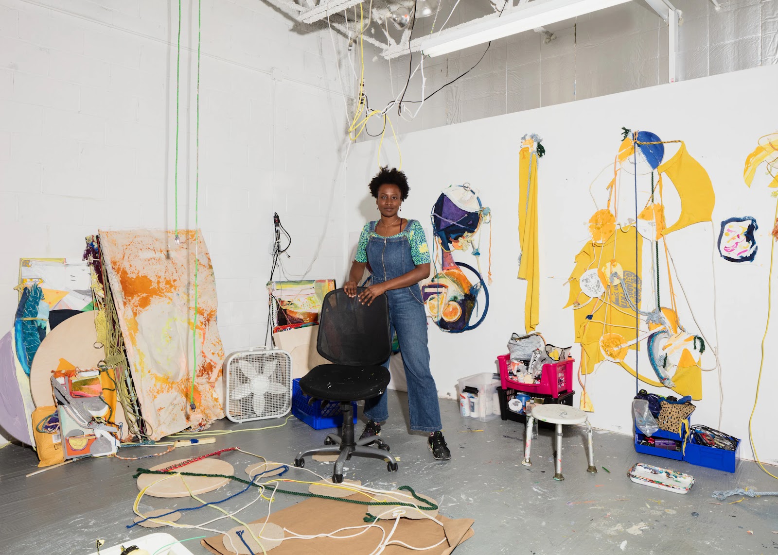
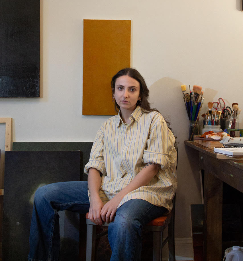
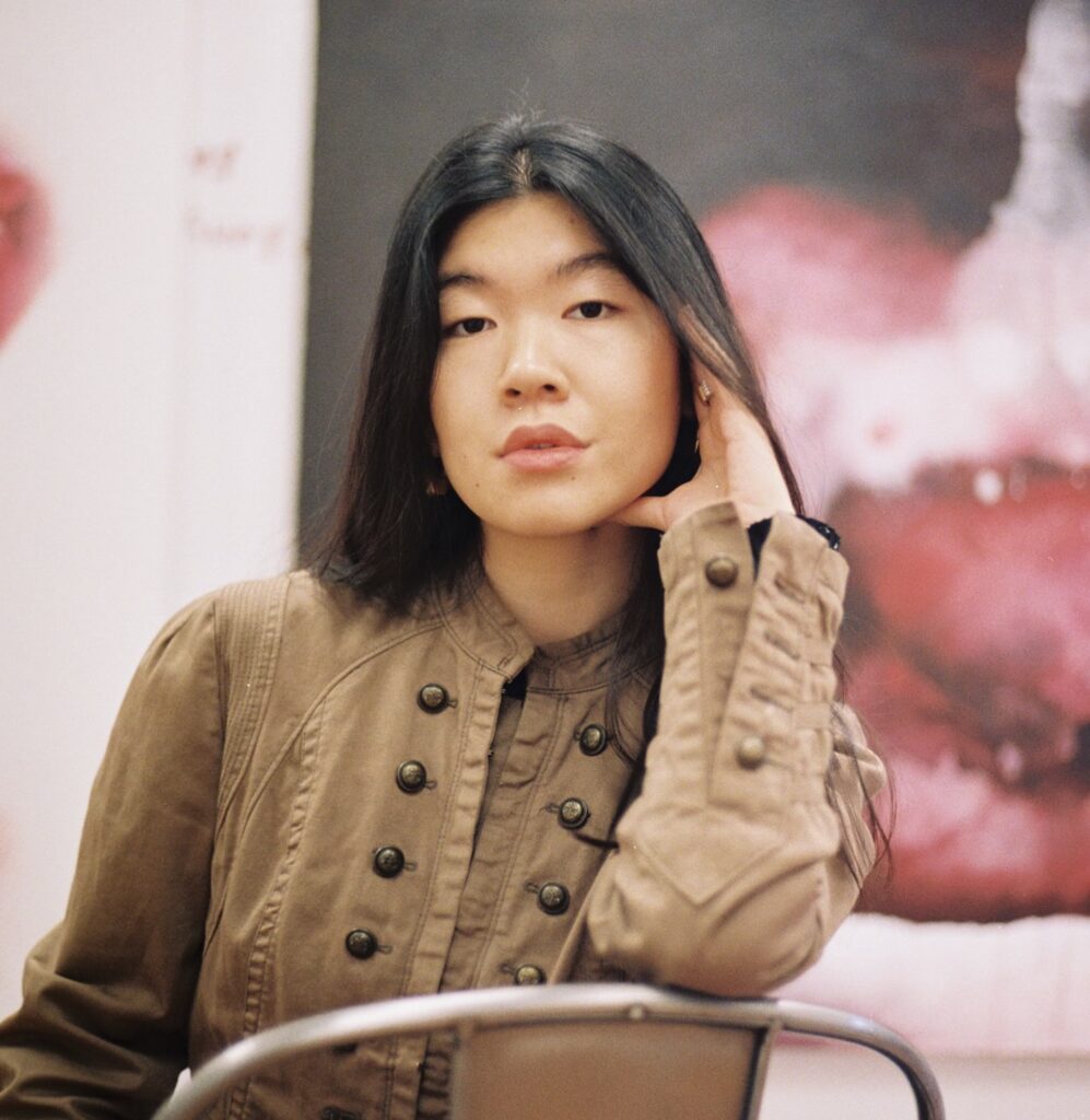
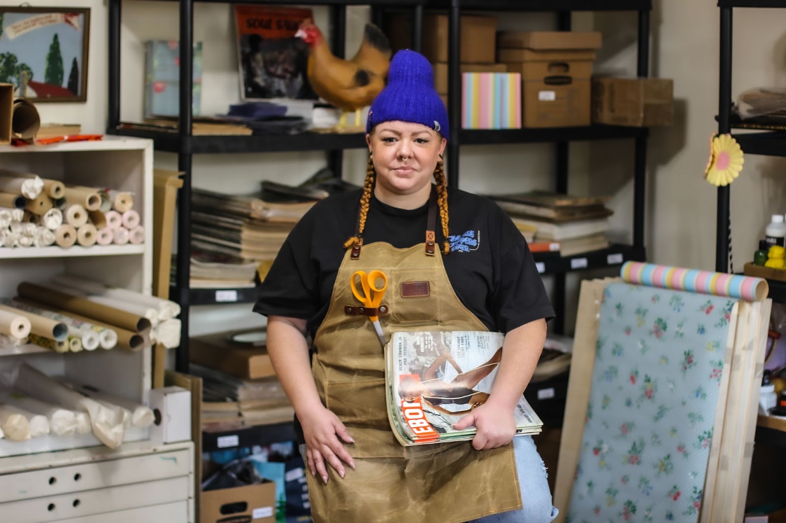
GENEVIEVE GAIGNARD
NB: What are some of your earliest memories of making art and how does it relate to what you’re making now?
GG: I remember sketching faces from magazines, I would like the eyes of one person and the nose of another, and from there make unique portraits.
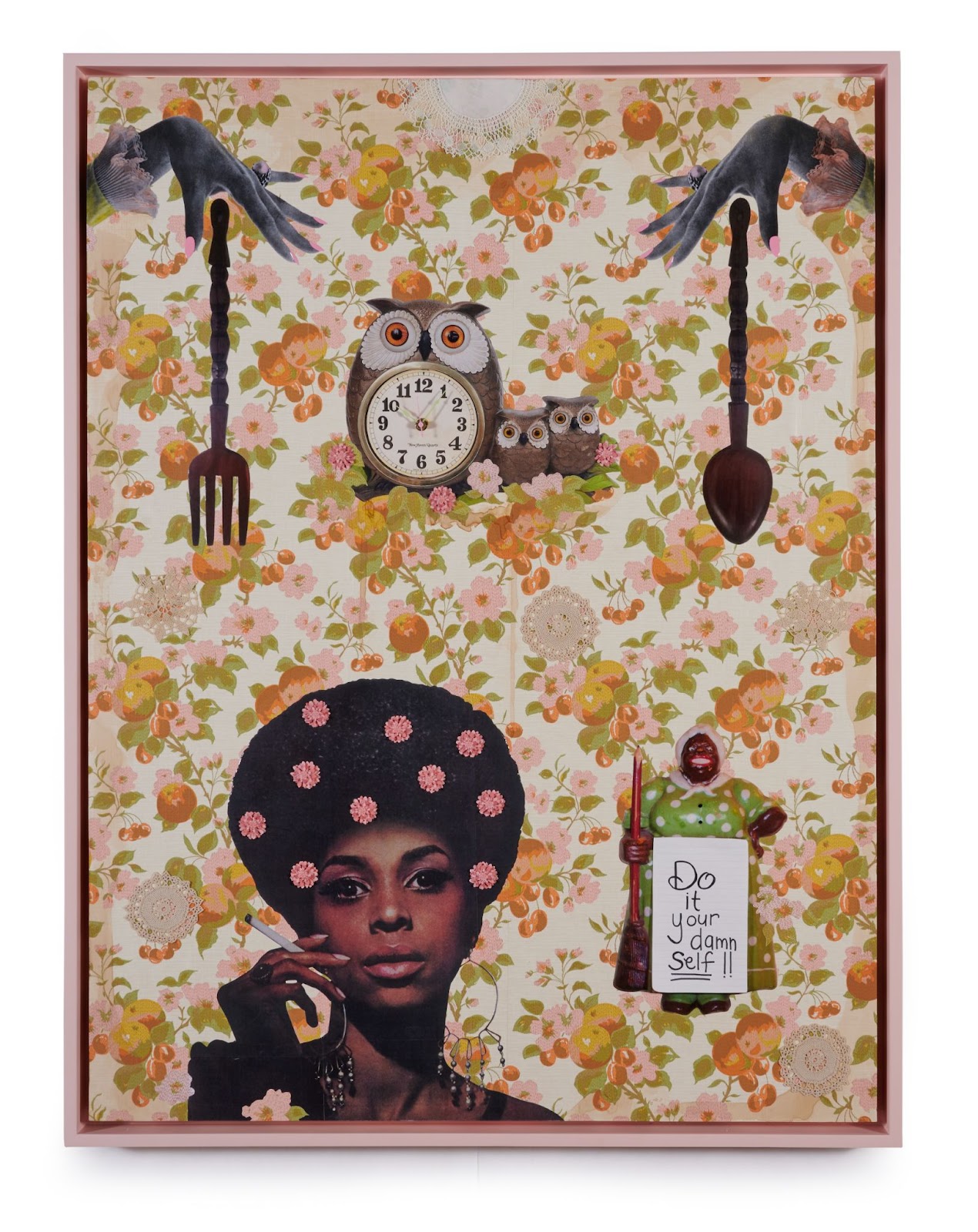
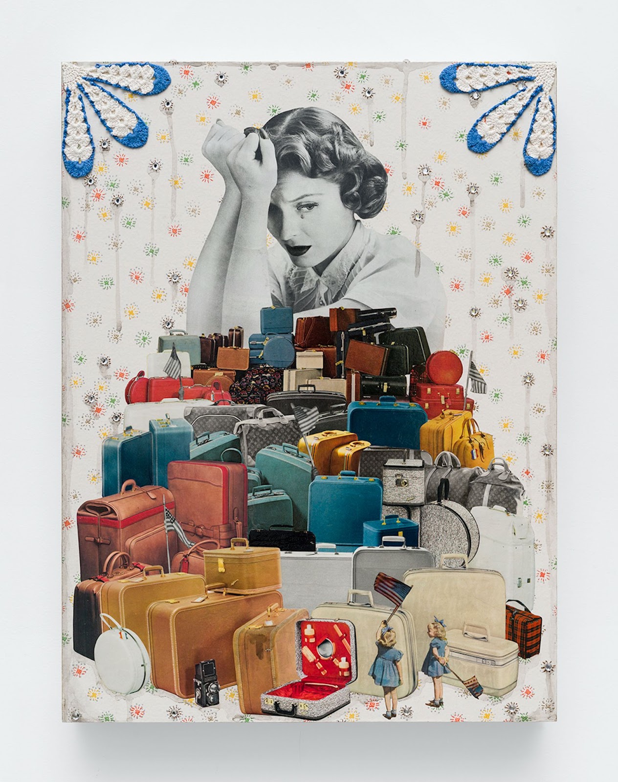
I often had a sketch pad with me, and I was also collaging the walls in my bedroom as the angsty teen I was. I grew up in an old house and the walls were covered in wallpaper. I didn’t plan to work with wallpaper as a material when I first started using it in my work, but now I can see the connection. I was using wallpaper pretty early on; it was instinctual and I was simply drawn to it.
NB: Can you tell us about your process and the different mediums you use in your practice?
GG: Let’s start with photography because I went to school for photography. Even though I was working in all these different ways and exploring all these different mediums while in school, photography was the medium that spoke to me first. I saw the work of Diane Arbus and I was just like “that’s what I want to do.” Then I got a camera like hers, tried to print like her. I wasn’t necessarily going up to strangers and photographing them, but I’d get my mom to do weird stuff that I thought felt like something Arbus would photograph. And then I slowly kind of started to turn the camera more on myself. Once I started photographing myself as these different characters, I often got compared to Cindy Sherman, and I understood that connection, obviously. Still I felt like I was trying to get at something beyond that, so I would make shoes. I’m not a cobbler, but I would use shoes that I had and add different materials to the exterior of the shoes. During this process I was often thinking–what does that shoe represent or tell you about the person that would be wearing them if the person wasn’t there?
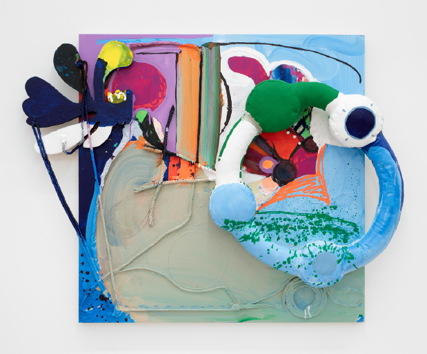
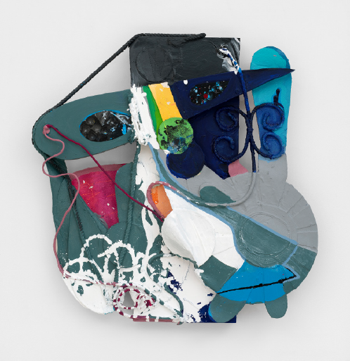
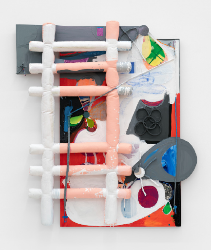
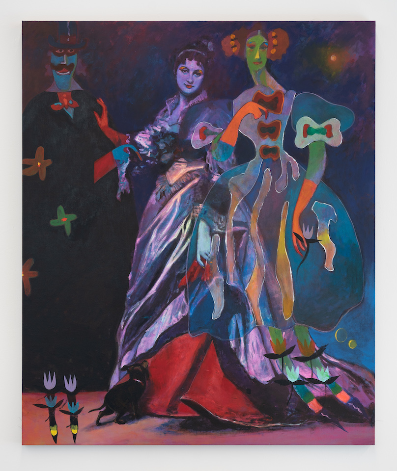
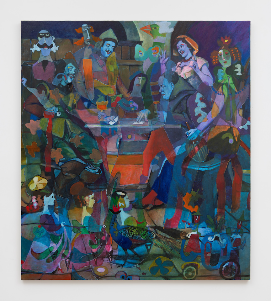
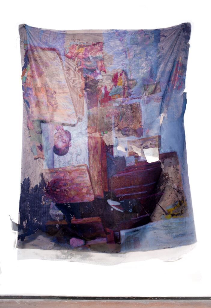
Collage has always been there, too. I felt I was getting somewhere with photography, but because everyone takes in information differently, maybe they didn’t get the full story with the photo. So I thought about how I can expand on that with collage, and if they still didn’t fully get it, then how can I expand with installation? That’s how installation became a part of my practice. Today I think of installations as psychological spaces that give the viewer an insight on the character (me) that they are seeing in the photographs. In my installations there are many objects throughout that allow people to create some sort of vignette, and when looking at these things it might create a familiar feeling or spark some sort of memory, yet it might also put the viewer in a place that they’re not as familiar with.
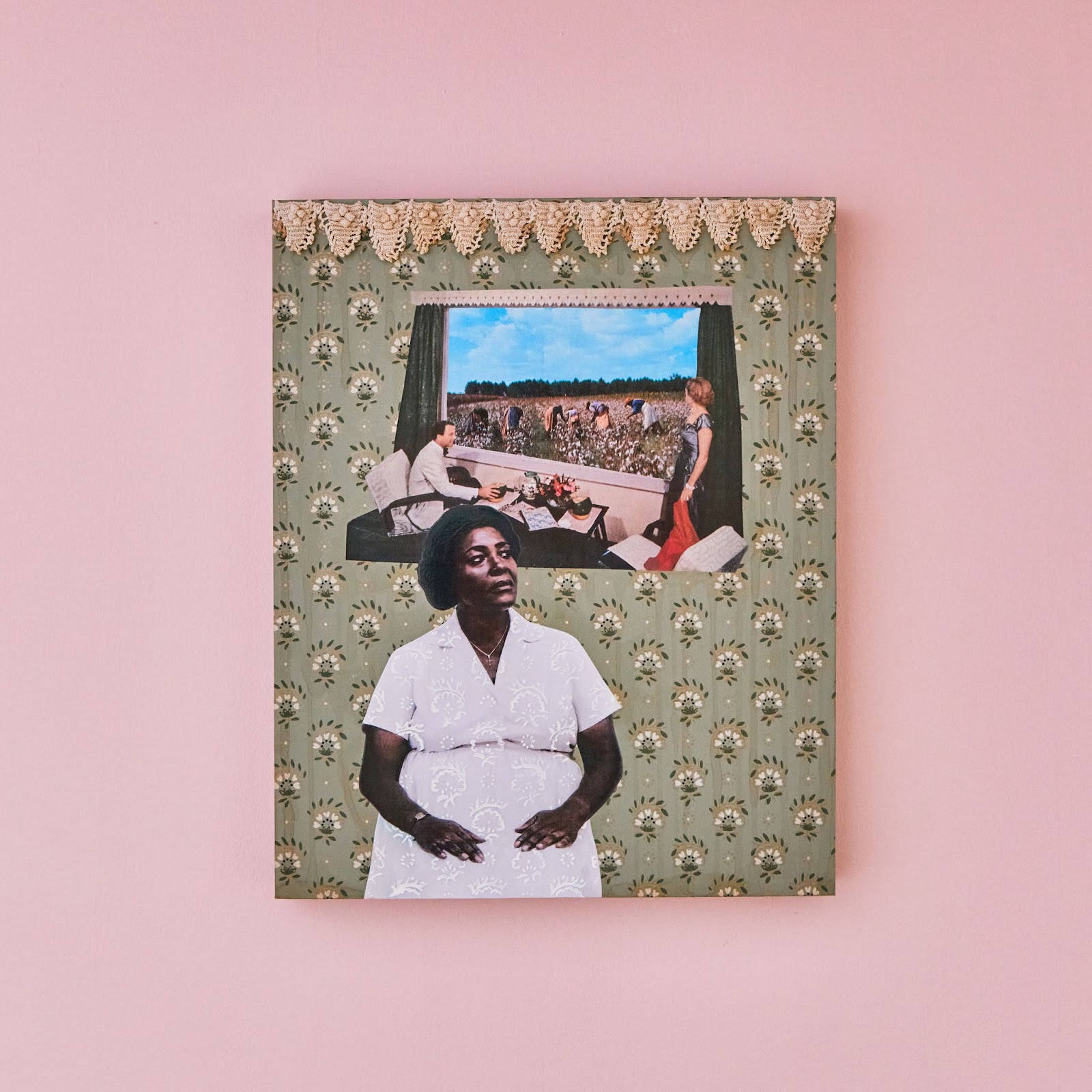
At times there can be stereotypical things that you would find in a white family’s home and also in a stereotypical Black family’s home. So I ask, “what do those things look like together?” Because that’s more of the space I grew up in, and I think this is also a way to bring people together.
NB: How does each medium help you explore the different themes within your practice?
GG: It all starts with photography. I think specifically through photography I talk about my mixed race identity, and how I navigate the world. I didn’t want to do it by photographing other people because I barely knew what I was dealing with, so I ended up using myself as the subject. Working in that way allowed me to gain more understanding about how I can further that conversation through the other mediums.
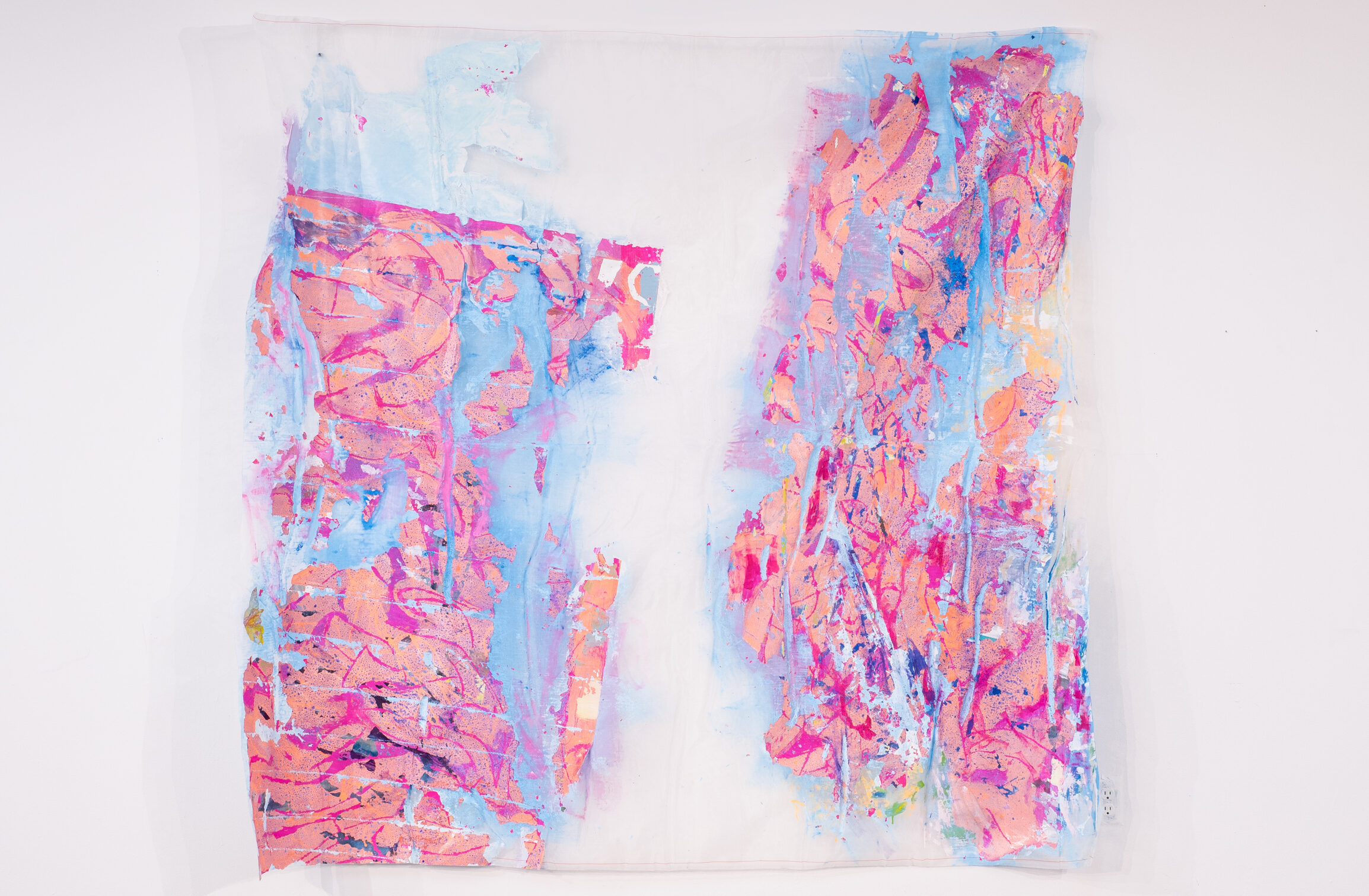
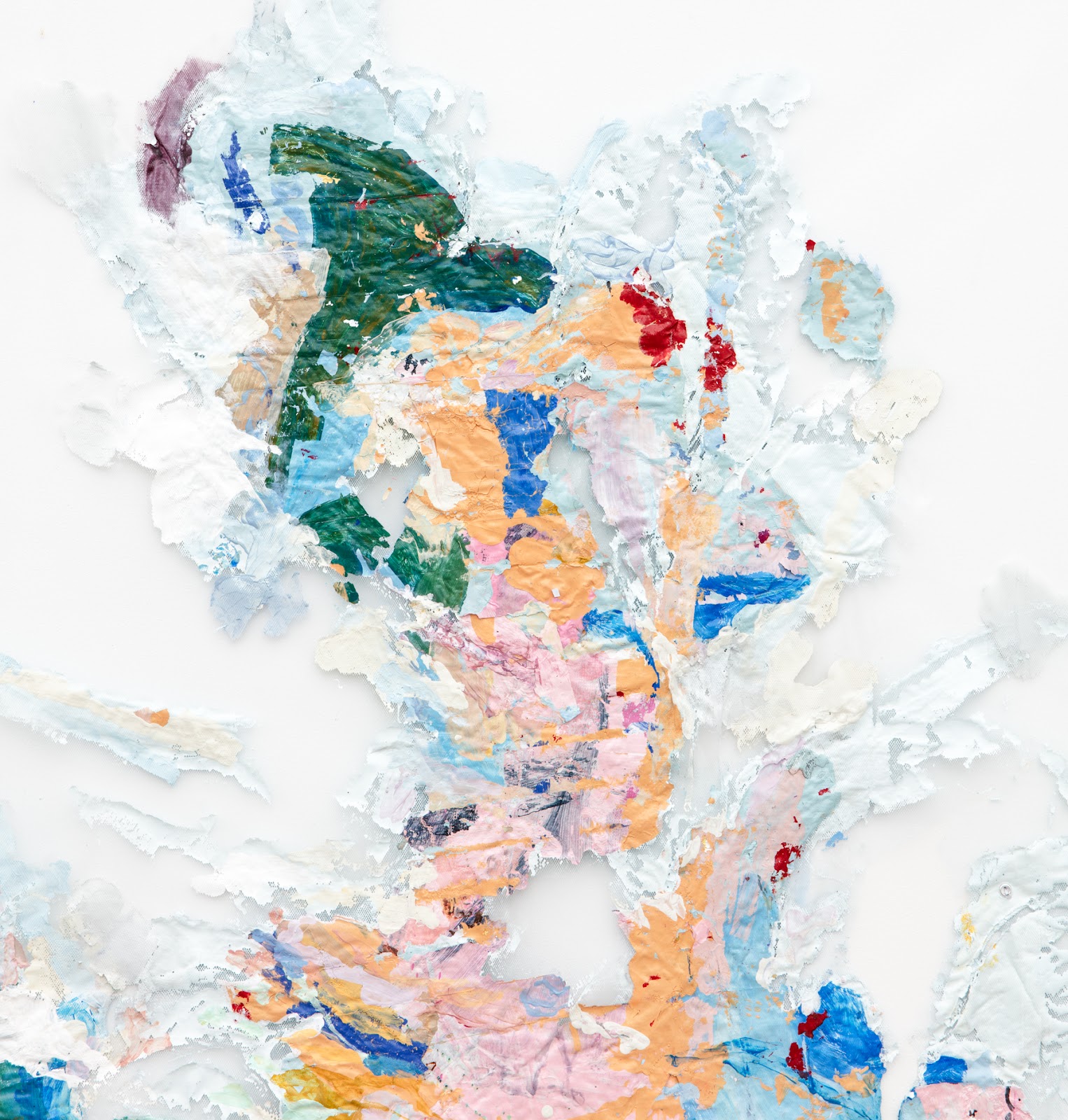
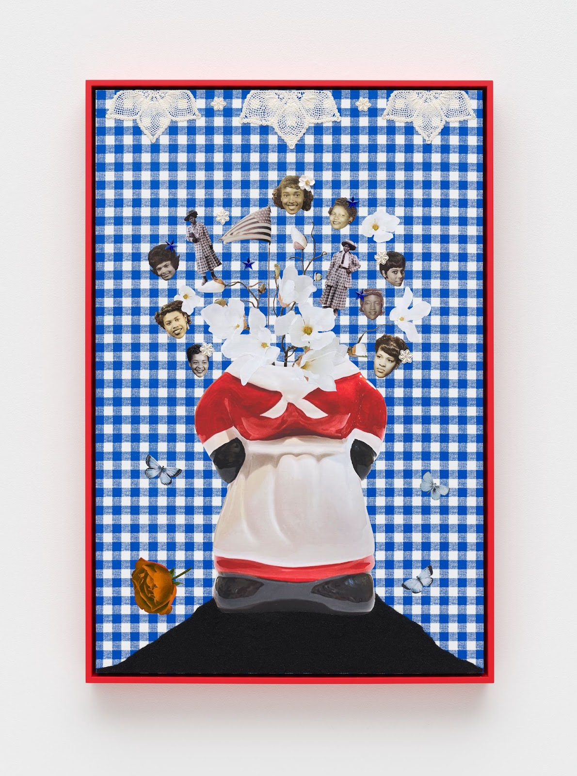
I would say that collage is an expansion of that previous theme. Photography is more direct: you hit the button, you get the print, and when it’s good you move on. Yet I always get the feeling-I’ve got to do more with it, and so I incorporate collage which I think of as a “cut out of the installation,” in a way. The way I approach installation is similar to how I might create a collage, and so the two mirror each other at times, and work as a call back for the viewer. Wallpapers are a big part of it too, because you’re working with patterns and shapes, and they bring this nostalgic and comforting feel. I’m taking lots of pictures on my phone, simply gathering material that I’ll combine with magazine images or my family’s photo archive.
I have my own personal image archive of African American family photos and photo booth pictures because at the end of the day, I have a big love for photography. Growing up predominantly in white spaces, I didn’t often have access to these images, hence why I use Ebony, Life and Jet magazines because I needed my colleges to represent something that looks more like the diverse world we live in. To be clear, I used Ebony, Life and Jet because white America excluded imagery of Black folks from their popular magazines. I also collect vintage photographs, so I’ll have an array of images that I’ll use for collages.
NB: Could you expand on these themes and tell us about your work from the lens of a woman in America? How do you see this being affected by technology today?
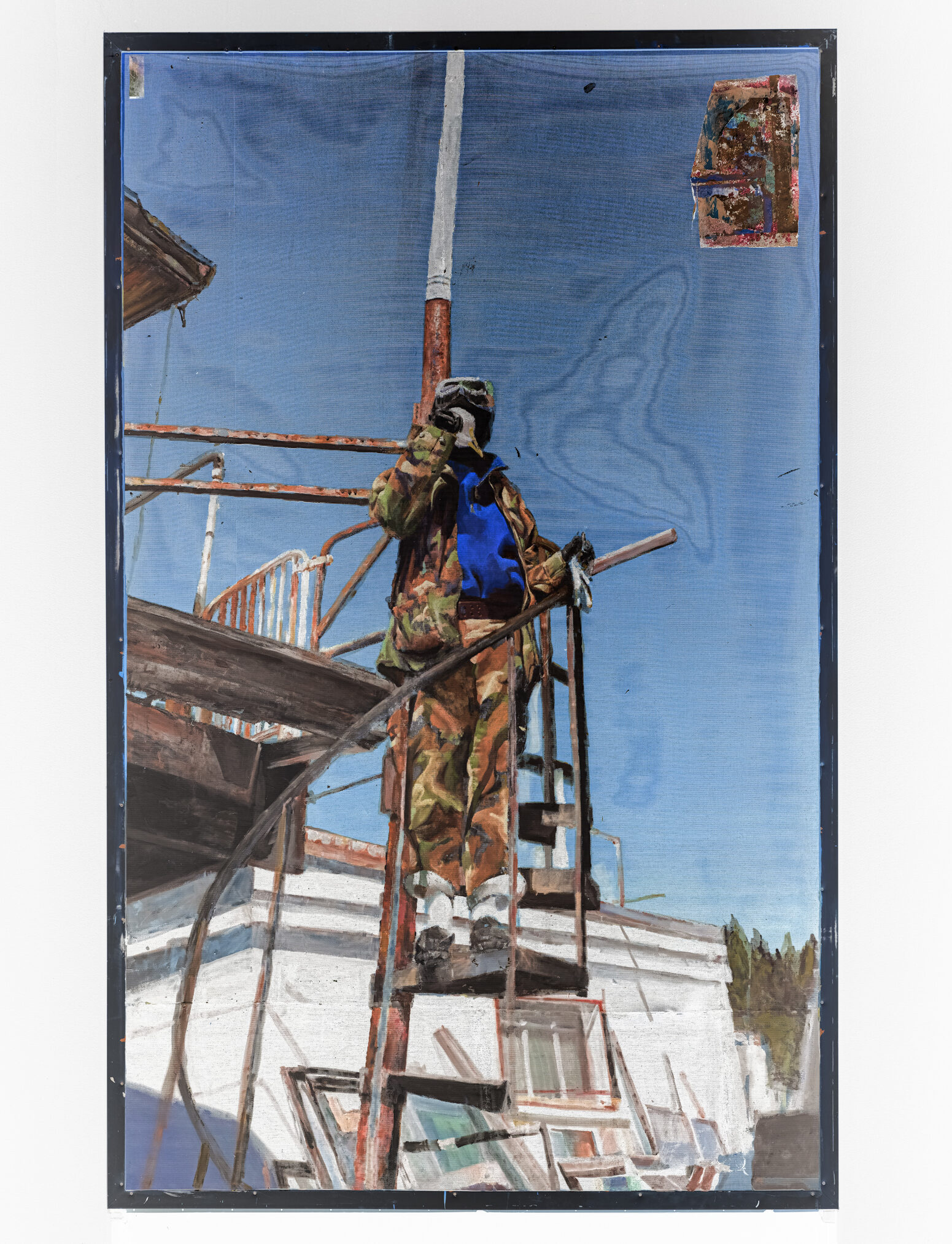
GG: My work very much lives in a feminine space, and Americana is also quite present in my work. I am often speaking towards race and identity in America, which is inevitable because I come from a family of interracial parents in Massachusetts. My mom’s from Maine, my dad’s from New Orleans, so you get this northern and southern mix. For me this is a blend of two extremely different places and experiences.
I use materials that maybe seem less threatening, in a way, because they’re everyday materials, and if it smells like warm apple pie it brings the viewer into the familiarity of a domestic space. I like using these materials to slightly trick the viewer into thinking that the work will be light and breezy. Up close the work is actually much weirder, and you’re hit with the reality of these moments and themes in the work that people often don’t want to talk about. I just want to create a space where I can unpack these themes a bit more, not only speaking about my story, but where the viewer’s story impacts this story, and my story.
As far as technology goes, I’m kind of old school. I’m still excited about the fact that if I need a photo or any reference I just go out, take it on my phone or my camera, and then I can print it right away in my studio. Then I’ll use that image combined with hand painted wallpaper. It’s the old and the new, the hand painted wallpaper with iPhone photos. The use of Americana imagery and its materials is also a comment on class, giving information to the viewer about where I come from, and these items might be stained, torn, or tattered. The house I grew up in still has the same wallpaper from years ago; most households don’t have the means to upgrade their homes to each new decade or trend.
My favorite part of creating, especially with the collage works, is deciding what a piece is going to be about. Then I get distracted on Instagram for a minute, scroll endlessly, and see so many things that spark new ideas. Then I add layers to the work of what I was originally thinking, with the addition of the current news flash or trend that scrolled across my screen while creating a work.
NB: So do you have any upcoming projects or exhibitions you would like to share with us
GG: Yes, so you’re sitting with me here in the studio and you’re looking at works that will be part of a show opening in September at Vielmetter Los Angeles, called Thinking Out Loud – and I’m mostly in the midst of creating that show. I’m also in a traveling group show called “Multiplicity” which is all about collage. The last and final iteration of the show has just opened at The Phillips Collection in Washington, D.C.